A Bayesian Analysis of Lego Prices in Python with PyMC3
This post is the second in a series of posts analyzing Lego pricing data scraped from brickset.com. The first post gave an empirical analysis of the fairness of the price for Darth Vader’s Meditation Chamber (75296), disproving my initial impression that the set was overpriced for its size and prompting me to preorder it. In this post we will build several more formal models of the price of Lego sets based on their size and use them to answer a few related questions.

First we make the necessary Python imports and do some light housekeeping.
%matplotlib inlineimport datetime
from functools import reduce
import itertools as itl
from warnings import filterwarningsfrom aesara import shared, tensor as at
import arviz as az
from matplotlib import MatplotlibDeprecationWarning, pyplot as plt
from matplotlib.lines import Line2D
from matplotlib.ticker import FuncFormatter, MultipleLocator, StrMethodFormatter
import numpy as np
import pandas as pd
import pymc3 as pm
import scipy as sp
from sklearn.preprocessing import StandardScaler
import seaborn as snsfilterwarnings('ignore', category=UserWarning, message=".*FixedFormatter.*")
filterwarnings('ignore', category=MatplotlibDeprecationWarning, module='pandas')
filterwarnings('ignore', category=UserWarning, module='aesara')
filterwarnings('ignore', category=UserWarning, module='arviz')
filterwarnings('ignore', category=UserWarning, module='pandas')plt.rcParams['figure.figsize'] = (8, 6)
sns.set(color_codes=True)
dollar_formatter = StrMethodFormatter("${x:,.2f}")Load the Data
We begin the real work by loading the data scraped from Brickset. See the first post in this series for more background on the data.
DATA_URL = 'https://austinrochford.com/resources/lego/brickset_01011980_06012021.csv.gz'def to_datetime(year):
return np.datetime64(f"{round(year)}-01-01")full_df = (pd.read_csv(DATA_URL,
usecols=[
"Year released", "Set number",
"Name", "Set type", "Theme", "Subtheme",
"Pieces", "RRP"
])
.dropna(subset=[
"Year released", "Set number",
"Name", "Set type", "Theme",
"Pieces", "RRP"
]))
full_df["Year released"] = full_df["Year released"].apply(to_datetime)
full_df = (full_df.set_index(["Year released", "Set number"])
.sort_index())We see that the data set contains information on approximately 8,500 Lego sets produced between 1980 and June 2021.
full_df.head()| Name | Set type | Theme | Pieces | RRP | Subtheme | ||
|---|---|---|---|---|---|---|---|
| Year released | Set number | ||||||
| 1980-01-01 | 1041-2 | Educational Duplo Building Set | Normal | Dacta | 68.0 | 36.50 | NaN |
| 1075-1 | LEGO People Supplementary Set | Normal | Dacta | 304.0 | 14.50 | NaN | |
| 1101-1 | Replacement 4.5V Motor | Normal | Service Packs | 1.0 | 5.65 | NaN | |
| 1123-1 | Ball and Socket Couplings & One Articulated Joint | Normal | Service Packs | 8.0 | 16.00 | NaN | |
| 1130-1 | Plastic Folder for Building Instructions | Normal | Service Packs | 1.0 | 14.00 | NaN |
full_df.tail()| Name | Set type | Theme | Pieces | RRP | Subtheme | ||
|---|---|---|---|---|---|---|---|
| Year released | Set number | ||||||
| 2021-01-01 | 80022-1 | Spider Queen’s Arachnoid Base | Normal | Monkie Kid | 1170.0 | 119.99 | Season 2 |
| 80023-1 | Monkie Kid’s Team Dronecopter | Normal | Monkie Kid | 1462.0 | 149.99 | Season 2 | |
| 80024-1 | The Legendary Flower Fruit Mountain | Normal | Monkie Kid | 1949.0 | 169.99 | Season 2 | |
| 80106-1 | Story of Nian | Normal | Seasonal | 1067.0 | 79.99 | Chinese Traditional Festivals | |
| 80107-1 | Spring Lantern Festival | Normal | Seasonal | 1793.0 | 119.99 | Chinese Traditional Festivals |
full_df.describe()| Pieces | RRP | |
|---|---|---|
| count | 8502.000000 | 8502.000000 |
| mean | 258.739591 | 31.230506 |
| std | 481.627846 | 44.993559 |
| min | 0.000000 | 0.000000 |
| 25% | 32.000000 | 7.000000 |
| 50% | 98.000000 | 17.000000 |
| 75% | 300.000000 | 39.990000 |
| max | 11695.000000 | 799.990000 |
We also load data about my personal collection and add a column to full_df indicating whether or not I own each set.
MY_COLLECTION_URL = 'https://austinrochford.com/resources/lego/Brickset-MySets-owned-20210602.csv'my_df = pd.read_csv(MY_COLLECTION_URL)my_df.indexIndex(['8092-1', '10221-1', '10266-1', '10281-1', '10283-1', '21309-1',
'21312-1', '21320-1', '21321-1', '31091-1', '40174-1', '40268-1',
'40391-1', '40431-1', '40440-1', '41602-1', '41608-1', '41609-1',
'41628-1', '75030-1', '75049-1', '75074-1', '75075-1', '75093-1',
'75099-1', '75136-1', '75137-1', '75138-1', '75162-1', '75176-1',
'75187-1', '75229-1', '75243-1', '75244-1', '75248-1', '75254-1',
'75255-1', '75263-1', '75264-1', '75266-1', '75267-1', '75269-1',
'75273-1', '75277-1', '75278-1', '75283-1', '75292-1', '75297-1',
'75302-1', '75306-1', '75308-1', '75317-1', '75318-1'],
dtype='object')full_df["austin"] = (full_df.index
.get_level_values("Set number")
.isin(my_df.index))Since the data spans more than 40 years, it is important to adjust for inflation. We use the Consumer Price Index for All Urban Consumers: All Items in U.S. City Average from the U.S. Federal Reserve to adjust for inflation.
CPI_URL = 'https://austinrochford.com/resources/lego/CPIAUCNS202100401.csv'years = pd.date_range('1979-01-01', '2021-01-01', freq='Y') \
+ datetime.timedelta(days=1)
cpi_df = (pd.read_csv(CPI_URL, index_col="DATE", parse_dates=["DATE"])
.loc[years])
cpi_df["to2021"] = cpi_df.loc["2021-01-01"] / cpi_dfWe now add a column RRP2021, which is RRP adjusted to 2021 dollars.
full_df["RRP2021"] = (pd.merge(full_df, cpi_df,
                               left_on=["Year released"],
                               right_index=True)
                        .apply(lambda df: df["RRP"] * df["to2021"],
                               axis=1))
Based on the exploratory data analysis in the previous post, we filter full_df down to approximately 6,300 sets to be included in our analysis.
FILTERS = [
    full_df["Set type"] == "Normal",
    full_df["Pieces"] > 10,
    full_df["Theme"] != "Duplo",
    full_df["Theme"] != "Service Packs",
    full_df["Theme"] != "Bulk Bricks",
    full_df["RRP"] > 0
]
df = full_df[reduce(np.logical_and, FILTERS)].copy()df.head()| Name | Set type | Theme | Pieces | RRP | Subtheme | austin | RRP2021 | ||
|---|---|---|---|---|---|---|---|---|---|
| Year released | Set number | ||||||||
| 1980-01-01 | 1041-2 | Educational Duplo Building Set | Normal | Dacta | 68.0 | 36.50 | NaN | False | 122.721632 |
| 1075-1 | LEGO People Supplementary Set | Normal | Dacta | 304.0 | 14.50 | NaN | False | 48.752429 | |
| 5233-1 | Bedroom | Normal | Homemaker | 26.0 | 4.50 | NaN | False | 15.130064 | |
| 6305-1 | Trees and Flowers | Normal | Town | 12.0 | 3.75 | Accessories | False | 12.608387 | |
| 6306-1 | Road Signs | Normal | Town | 12.0 | 2.50 | Accessories | False | 8.405591 |
df.describe()| Pieces | RRP | RRP2021 | |
|---|---|---|---|
| count | 6312.000000 | 6312.000000 | 6312.000000 |
| mean | 337.177440 | 37.038246 | 45.795998 |
| std | 535.619271 | 49.657704 | 58.952563 |
| min | 11.000000 | 0.600000 | 0.971220 |
| 25% | 68.000000 | 9.990000 | 11.866173 |
| 50% | 177.000000 | 19.990000 | 26.712319 |
| 75% | 400.000000 | 49.500000 | 55.952471 |
| max | 11695.000000 | 799.990000 | 897.373477 |
Modeling
Upon plotting the data, a linear relationship between the logarithm of pieces and the logarithm of reccomended retail price (in 2021 dollars) becomes immediately apparent.
ax = sns.scatterplot(x="Pieces", y="RRP2021", data=df,
                alpha=0.05);
sns.scatterplot(x="Pieces", y="RRP2021",
                data=df[df["austin"] == True],
                label="My sets", ax=ax);

ax.set_xscale('log');

ax.set_yscale('log');
ax.set_ylabel("Retail price (2021 $)");

ax.legend(loc='upper left');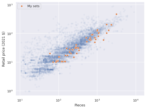
Pooled model
We start with a very simple pooled linear model of log price versus log pieces. Let \(Y_i\) denote the recommended retail price of the \(i\)-th set and \(y_i = \log Y_i\). Similarly, let \(X_i\) denote the number of pieces in the \(i\)-th set and \(x_i = \log X_i\). Due to the log-log linear relationship between \(Y_i\) and \(X_i\), our models will take the form
\[Y_i = f_i(X_i) \cdot \varepsilon_i,\]
where \(\varepsilon_i\) accounts for the unmeasured noise in the price of the \(i\)-th set. We place a log-normal prior on \(\varepsilon_i\) so that $ (_i) = 1$ and \(\textrm{Var}\left(\log(\varepsilon_j)\right) = \sigma_i^2.\) standard distributional math shows that
\[y_i \sim N\left(\log\left(f_i(X_i))\right) - \frac{\sigma_i^2}{2}, \sigma_i^2\right).\]
Each model is of the form
\[f_i(X_i) = b_{0, i} \cdot X_i^{\beta_i},\]
so
\[\log\left(f_i(X_i)\right) = \beta_{0, i} + \beta_i x_i,\]
where \(\beta_{0, i} = \log b_{0, i}\).
We define log_pieces and log_rrp2021 which correspond to \(x_i\) and \(y_i\) respectively.
pieces = df["Pieces"].values
log_pieces = np.log(df["Pieces"].values)

rrp2021 = df["RRP2021"].values
log_rrp2021 = np.log(rrp2021)
For computational efficiency, we will standardize \(x_i\) to produce \(\tilde{x}_i\) which has mean zero and variance one.
scaler = StandardScaler().fit(log_pieces[:, np.newaxis])

def scale_log_pieces(log_pieces, scaler=scaler):
    return scaler.transform(log_pieces[:, np.newaxis])[:, 0]

std_log_pieces = scale_log_pieces(log_pieces)
std_log_pieces_ = shared(std_log_pieces)
Here definining std_log_pieces_ as an aesara shared variable will allow us to change its value later for posterior predictive sampling.
Our models are therefore given by
\[\log\left(f_i(X_i)\right) = \beta_{0, i} + \beta_i \tilde{x}_i.\]
For the pooled model, \(\beta_{0, i} = \beta_0\), \(\beta_i = \beta\), and \(\sigma_i = \sigma\) are constant across all sets. We give them the priors
\[ \begin{align*} \beta_0 & \sim N(0, 2.5^2) \\ \beta & \sim N(0, 2.5^2) \\ \sigma & \sim \textrm{HalfNormal}(5^2). \end{align*} \]
with pm.Model() as pooled_model:
    β0 = pm.Normal("β0", 0., 2.5)
    β_pieces = pm.Normal("β_pieces", 0., 2.5)

    σ = pm.HalfNormal("σ", 5.)
We define the mean and likelihood of the observed data as above.
with pooled_model:
    μ = β0 + β_pieces * std_log_pieces_ - 0.5 * σ**2
    obs = pm.Normal("obs", μ, σ, observed=log_rrp2021)
We now sample from posterior distribution of this model.
CHAINS = 3
SEED = 123456789

SAMPLE_KWARGS = {
    'cores': CHAINS,
    'random_seed': [SEED + i for i in range(CHAINS)],
    'return_inferencedata': True
}
with pooled_model:
pooled_trace = pm.sample(**SAMPLE_KWARGS)Auto-assigning NUTS sampler...
Initializing NUTS using jitter+adapt_diag...
Multiprocess sampling (3 chains in 3 jobs)
NUTS: [β0, β_pieces, σ]100.00% [6000/6000 00:15<00:00 Sampling 3 chains, 0 divergences]
Sampling 3 chains for 1_000 tune and 1_000 draw iterations (3_000 + 3_000 draws total) took 18 seconds.The energy plot, BFMI, and \(\hat{R}\) statistics for these samples show no cause for concern.
def make_diagnostic_plots(trace, axes=None, min_mult=0.995, max_mult=1.005):
    if axes is None:
        fig, axes = plt.subplots(ncols=2, sharex=False, sharey=False,
                                 figsize=(16, 6))

    az.plot_energy(trace, ax=axes[0])


    rhat = az.rhat(trace).max()
    axes[1].barh(np.arange(len(rhat.variables)), rhat.to_array(),
                 tick_label=list(rhat.variables.keys()))
    axes[1].axvline(1, c='k', ls='--')

    axes[1].set_xlim(
        min_mult * min(rhat.min().to_array().min(), 1),
        max_mult * max(rhat.max().to_array().max(), 1)
    )
    axes[1].set_xlabel(r"$\hat{R}$")

    axes[1].set_ylabel("Variable")

return fig, axesmake_diagnostic_plots(pooled_trace);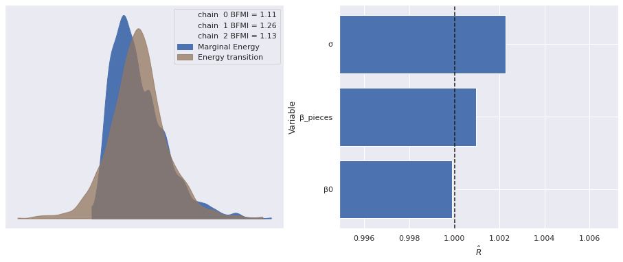
We sample from the posterior predictive distribution at the observed data points and plot the residuals.
with pooled_model:
    pp_trace_data = pm.sample_posterior_predictive(pooled_trace)

df["pooled_resid"] = (log_rrp2021 - pp_trace_data["obs"]).mean(axis=0)
100.00% [3000/3000 00:02<00:00]
ax = sns.scatterplot(x="Pieces", y="pooled_resid", data=df,
                     alpha=0.1)

ax.set_xscale('log');
ax.set_xlabel("Pieces");

ax.set_ylabel("Log RRP residual (2021 $)");

ax.set_title("Pooled model");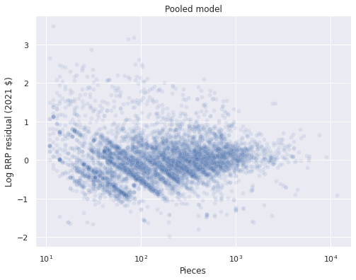
We will investigate these residuals further shortly. First we sample from the posterior predictive distribution along a grid spanning reasonable values of pieces and plot the resulting predictions.
pp_pieces = np.logspace(1, np.log10(pieces.max()))
pp_log_pieces = np.log(pp_pieces)
pp_std_log_pieces = scale_log_pieces(pp_log_pieces)std_log_pieces_.set_value(pp_std_log_pieces)with pooled_model:
pooled_pp_trace = pm.sample_posterior_predictive(pooled_trace)100.00% [3000/3000 00:01<00:00]
ax = sns.scatterplot(x="Pieces", y="RRP2021", data=df,
                alpha=0.05);
sns.scatterplot(x="Pieces", y="RRP2021",
                data=df[df["austin"] == True],
                alpha=0.5, label="My sets",
                ax=ax);

pp_low, pp_high = np.percentile(
    np.exp(pooled_pp_trace["obs"]),
    [2.5, 97.4],
    axis=0
)
ax.plot(pp_pieces, np.exp(pooled_pp_trace["obs"]).mean(axis=0),
        c='k', label="Posterior predicted mean");
ax.fill_between(pp_pieces, pp_low, pp_high,
                color='k', alpha=0.15, zorder=-1,
                label="95% posterior interval");

ax.set_xscale('log');

ax.set_yscale('log');
ax.set_ylabel("Retail price (2021 $)");

ax.legend(loc='upper left');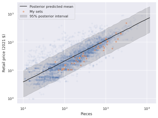
The predictions seem reasonable. We now plot the posterior distribution of the regression coefficients.
az.plot_posterior(pooled_trace, var_names=["β0", "β_pieces"]);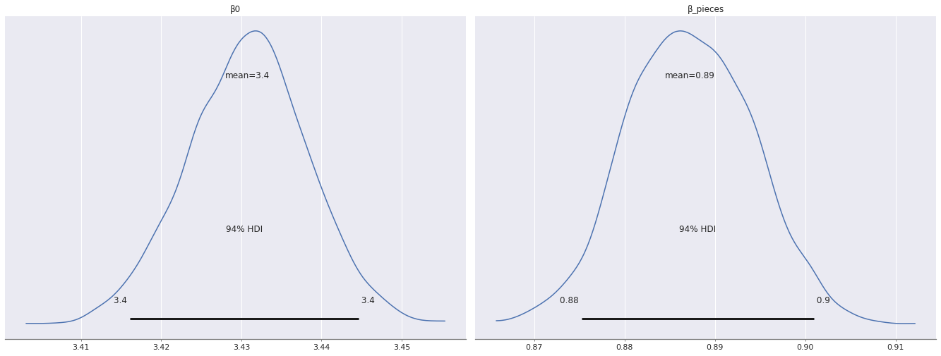
When we break down the residuals for a few notable themes, we see that Star Wars and Disney sets have larger residuals than Creator sets with the corresponding number of pieces.
ax = sns.scatterplot(x="Pieces", y="pooled_resid", data=df,
                     alpha=0.1)

for theme in ["Star Wars", "Creator", "Disney"]:
    sns.scatterplot(x="Pieces", y="pooled_resid",
                    data=df[df["Theme"] == theme],
                    alpha=0.5, label=f"{theme} sets",
                    ax=ax);

ax.set_xscale('log');
ax.set_xlabel("Pieces");

ax.set_ylabel("Log RRP residual (2021 $)");

ax.set_title("Pooled model");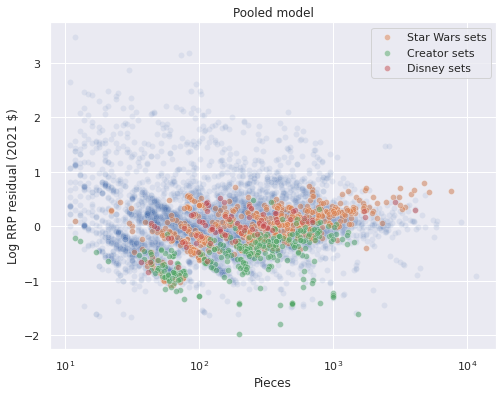
This difference in the distribution of residuals across themes suggests that we introduce theme-specific factors into our model.
Unpooled model
In order to introduce theme-specific factors, we create indicator variables for each theme.
theme_id, theme_map = df["Theme"].factorize(sort=True)
n_theme = theme_map.size

theme_id_ = shared(theme_id)
The simplest model that includes theme-specific factors is an unpooled model that consists of independent regressions per theme. With \(j(i)\) denoting the index of the theme of the \(i\)-th set, we have the model
\[\log\left(f_i(X_i)\right) = \beta_{0, j(i)} + \beta_{j(i)} \tilde{x}_i\]
with the i.i.d. priors
\[ \begin{align*} \beta_{0, 1}, \ldots \beta_{0, n_j} & \sim N(0, 2.5^2) \\ \beta_1, \ldots \beta_{n_j} & \sim N(0, 2.5^2) \\ \sigma_1, \ldots, \sigma_{n_j} & \sim \textrm{HalfNormal}(5^2). \end{align*} \]
std_log_pieces_.set_value(std_log_pieces)with pm.Model() as unpooled_model:
β0 = pm.Normal("β0", 0., 2.5, shape=n_theme)
β_pieces = pm.Normal("β_pieces", 0., 2.5, shape=n_theme)
σ = pm.HalfNormal("σ", 5., shape=n_theme)
μ = β0[theme_id_] + β_pieces[theme_id_] * std_log_pieces_ \
- 0.5 * σ[theme_id_]**2
obs = pm.Normal("obs", μ, σ[theme_id_], observed=log_rrp2021)We don’t actually sample from this model because it is underdetermined for many themes that have few sets associated with them, as the following plot shows.
ax = (df["Theme"]
        .value_counts()
        .nsmallest(n=20)
        .plot.barh())

ax.set_xlabel("Number of sets");
ax.set_ylabel("Theme");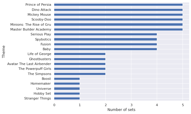
There are five themes with only a single set, and a number of themes with fewer than five sets total. Regression models with only a single data point are underdetermined, and those with few observations are likely to have wide error bars. Instead of imposing a minimum number of sets per theme and then using an unpooled model, we will use a partially pooled model to share some information across themes/regularize while allowing themes with many sets to deviate from the average if the data indicate that they should.
Partially pooled model
One model that shares information across themes is called “partially pooled” (it may also be called multilevel or hierarchical). In the partially pooled model, the intercept and piece coefficient for each theme are drawn not from i.i.d normal distributions but from a normal distribution with a common mean and variance. This shared hyperprior distribution regularizes the theme intercepts and coefficients, shrinking those for themes with fewer sets towards the pooled values.
Conceptually, we use the priors
\[ \begin{align*} \mu_{\beta_0} & \sim N(0, 2.5^2) \\ \sigma_{\beta_0} & \sim \textrm{HalfNormal}(2.5^2) \\ \beta_{0, 1}, \ldots, \beta_{0, n_j} & \sim N\left(\mu_{\beta_0}, \sigma_{\beta_0}^2\right) \end{align*} \]
and similarly for \(\beta\). In reality, we use a non-centered parametrization parameterization that is mathematically equivalent but often more computationally efficient.
def hierarchical_normal(name, shape, μ=None):
    if μ is None:
        μ = pm.Normal(f"μ_{name}", 0., 2.5)

    Δ = pm.Normal(f"Δ_{name}", 0., 1., shape=shape)
    σ = pm.HalfNormal(f"σ_{name}", 2.5)

    return pm.Deterministic(name, μ + Δ * σ)
with pm.Model() as partial_model:
β0 = hierarchical_normal("β0", n_theme)
β_pieces = hierarchical_normal("β_pieces", n_theme)
σ = pm.HalfNormal("σ", 5.)
μ = β0[theme_id_] + β_pieces[theme_id_] * std_log_pieces_ \
- 0.5 * σ**2
obs = pm.Normal("obs", μ, σ, observed=log_rrp2021)with partial_model:
partial_trace = pm.sample(**SAMPLE_KWARGS)Auto-assigning NUTS sampler...
Initializing NUTS using jitter+adapt_diag...
Multiprocess sampling (3 chains in 3 jobs)
NUTS: [μ_β0, Δ_β0, σ_β0, μ_β_pieces, Δ_β_pieces, σ_β_pieces, σ]100.00% [6000/6000 03:15<00:00 Sampling 3 chains, 0 divergences]
Sampling 3 chains for 1_000 tune and 1_000 draw iterations (3_000 + 3_000 draws total) took 196 seconds.
The estimated number of effective samples is smaller than 200 for some parameters.
Again our diagnostics show no cause for concern.
make_diagnostic_plots(partial_trace);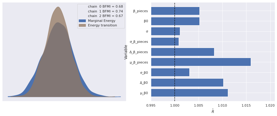
After calculating the residuals for the partially pooled model we see that they tend to be closer to zero and the diagonal bands are less pronounced.
with partial_model:
    pp_trace_data = pm.sample_posterior_predictive(partial_trace)

df["partial_resid"] = (log_rrp2021 - pp_trace_data["obs"]).mean(axis=0)
100.00% [3000/3000 00:02<00:00]
fig, axes = plt.subplots(ncols=2, sharex=True, sharey=True,
                         figsize=(14, 6))

sns.scatterplot(x="Pieces", y="pooled_resid", data=df,
                alpha=0.1, ax=axes[0]);

axes[0].set_xscale('log');
axes[0].set_xlabel("Pieces");

axes[0].set_ylabel("Log RRP residual (2021 $)");

axes[0].set_title("Pooled model");

sns.scatterplot(x="Pieces", y="partial_resid", data=df,
                alpha=0.1, ax=axes[1]);

axes[1].set_xscale('log');
axes[1].set_xlabel("Pieces");

axes[1].set_ylabel("Log RRP residual (2021 $)");

axes[1].set_title("Partially pooled model");

fig.tight_layout();
We also see that the residuals for the example themes (Star Wars, Creator, and Disney) are more comingled than for the pooled model.
fig, axes = plt.subplots(ncols=2, sharex=True, sharey=True,
                         figsize=(14, 6))

sns.scatterplot(x="Pieces", y="pooled_resid", data=df,
                alpha=0.1, ax=axes[0]);

for theme in ["Star Wars", "Creator", "Disney"]:
    sns.scatterplot(x="Pieces", y="pooled_resid",
                    data=df[df["Theme"] == theme],
                    alpha=0.5, label=f"{theme} sets",
                    ax=axes[0]);

axes[0].set_xscale('log');
axes[0].set_xlabel("Pieces");

axes[0].set_ylabel("Log RRP residual (2021 $)");

axes[0].set_title("Pooled model");

sns.scatterplot(x="Pieces", y="partial_resid", data=df,
                alpha=0.1, ax=axes[1]);

for theme in ["Star Wars", "Creator", "Disney"]:
    sns.scatterplot(x="Pieces", y="partial_resid",
                    data=df[df["Theme"] == theme],
                    alpha=0.5, label=f"{theme} sets",
                    ax=axes[1]);

axes[1].set_xscale('log');
axes[1].set_xlabel("Pieces");

axes[1].set_ylabel("Log RRP residual (2021 $)");

axes[1].set_title("Partially pooloed model");

fig.tight_layout();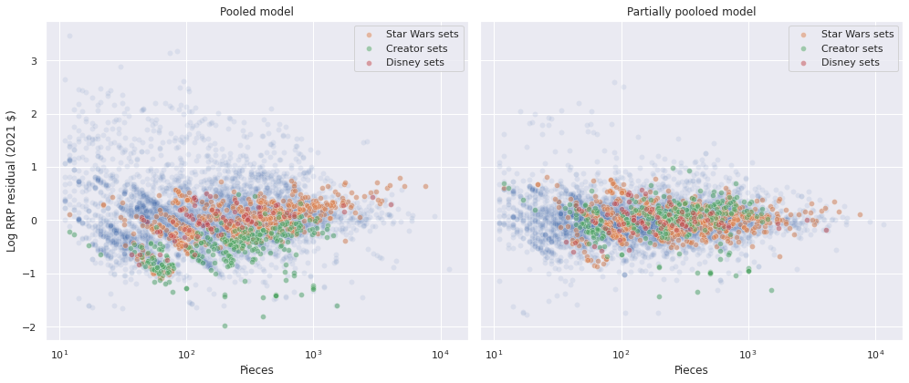
Now that we have posterior samples from two models, we use Pareto-smoothed importance sampling leave-one-out cross validation1
traces = {
    "Unpooled": pooled_trace,
    "Partially pooled": partial_trace
}
comp_df = az.compare(traces)comp_df.loc[:, :"weight"]| rank | loo | p_loo | d_loo | weight | |
|---|---|---|---|---|---|
| Partially pooled | 0 | -2315.578245 | 190.594364 | 0.000000 | 0.99951 |
| Unpooled | 1 | -5133.311893 | 4.871287 | 2817.733648 | 0.00049 |
fig, ax = plt.subplots(figsize=(12, 6))

az.plot_compare(comp_df, plot_ic_diff=False, ax=ax);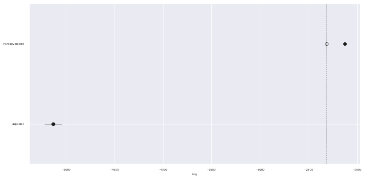
The table and chart show that by sharing some information across themes while also incorporating their varying effects the partially pooled model has substantially better predictive accuracy than the pooled model (higher values of loo correspond to better predictive ability).
In order to compare the posterior predictions of the pooled and partially pooled model directly, we need to define a grid over theme/standardized log piece combinations.
pp_df = pd.DataFrame.from_records(
    itl.product(range(n_theme), pp_std_log_pieces),
    columns=["theme_id", "std_log_pieces"]
)
pp_df["theme"] = theme_map[pp_df["theme_id"].values]
pp_df["pieces"] = np.exp(
    scaler.inverse_transform(pp_df["std_log_pieces"]
                                  .values[:, np.newaxis])
          .ravel()
)pp_df.head()| theme_id | std_log_pieces | theme | pieces | |
|---|---|---|---|---|
| 0 | 0 | -2.373432 | 4 Juniors | 10.000000 |
| 1 | 0 | -2.252260 | 4 Juniors | 11.550805 |
| 2 | 0 | -2.131088 | 4 Juniors | 13.342109 |
| 3 | 0 | -2.009916 | 4 Juniors | 15.411210 |
| 4 | 0 | -1.888744 | 4 Juniors | 17.801188 |
pp_df.tail()| theme_id | std_log_pieces | theme | pieces | |
|---|---|---|---|---|
| 6545 | 130 | 3.079305 | Znap | 6569.786072 |
| 6546 | 130 | 3.200477 | Znap | 7588.631734 |
| 6547 | 130 | 3.321649 | Znap | 8765.480484 |
| 6548 | 130 | 3.442820 | Znap | 10124.835517 |
| 6549 | 130 | 3.563992 | Znap | 11695.000000 |
std_log_pieces_.set_value(pp_df["std_log_pieces"].values)
theme_id_.set_value(pp_df["theme_id"].values)
We now sample from the posterior predictive distribution and compare the predictions to those from the pooled model.
with partial_model:
    partial_pp_trace = pm.sample_posterior_predictive(partial_trace)
100.00% [3000/3000 00:02<00:00]
pp_df["pp_partial_mean"] = np.exp(partial_pp_trace["obs"]).mean(axis=0)
pp_df["pp_partial_low"], pp_df["pp_partial_high"] = np.percentile(
    np.exp(partial_pp_trace["obs"]),
    [2.5, 97.5],
    axis=0
)pp_df.head()| theme_id | std_log_pieces | theme | pieces | pp_partial_mean | pp_partial_low | pp_partial_high | |
|---|---|---|---|---|---|---|---|
| 0 | 0 | -2.373432 | 4 Juniors | 10.000000 | 5.214650 | 2.380664 | 10.484612 |
| 1 | 0 | -2.252260 | 4 Juniors | 11.550805 | 5.917360 | 2.668467 | 11.413480 |
| 2 | 0 | -2.131088 | 4 Juniors | 13.342109 | 6.864103 | 3.045283 | 13.610948 |
| 3 | 0 | -2.009916 | 4 Juniors | 15.411210 | 7.653877 | 3.515344 | 14.966362 |
| 4 | 0 | -1.888744 | 4 Juniors | 17.801188 | 8.679962 | 4.009006 | 16.935274 |
ax = sns.scatterplot(x="Pieces", y="RRP2021", data=df,
                alpha=0.05);

(pp_df.groupby("theme_id")
      .plot("pieces", "pp_partial_mean",
            c='k', alpha=0.1, label='_nolegend_',
            ax=ax));
ax.plot(pp_pieces, np.exp(pooled_pp_trace["obs"]).mean(axis=0),
        c='r', lw=2, label="Pooled");

ax.set_xscale('log');

ax.set_yscale('log');
ax.set_ylabel("Retail price (2021 $)");

handles, _ = ax.get_legend_handles_labels()
partial_line = Line2D([0], [0], color='k',
                      label="Partially pooled")
handles.append(partial_line)

ax.legend(handles=handles,
          title="Posterior predicted mean",
          loc='upper left');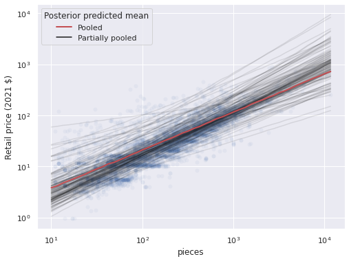
Note that the partial pooling model produces one line per theme, with varying slopes and intercepts. We can see that while the predictions for some themes are quite far away from the pooled predictions most are close to them, as shown by the stacking of the semi-transparent lines. Below we highlight the partially pooled predictions for a few themes of interest among all partially pooled predictions.
PLOT_THEMES = [
    "Creator Expert",
    "Disney",
    "Star Wars",
    "Harry Potter",
    "Marvel Super Heroes",
    "Ninjago",
    "City",
    "Space",
    "Jurassic World"
]
ax = sns.scatterplot(x="Pieces", y="RRP2021", data=df,
alpha=0.05);
(pp_df.groupby("theme_id")
.plot("pieces", "pp_partial_mean",
c='k', alpha=0.1, label='_nolegend_',
ax=ax));
(pp_df[pp_df["theme"].isin(PLOT_THEMES)]
.groupby("theme_id")
.plot("pieces", "pp_partial_mean",
c='r', label='_nolegend_',
ax=ax));
ax.set_xscale('log');
ax.set_yscale('log');
ax.set_ylabel("Retail price (2021 $)");
title = "Highlighted: " \
+ ", ".join(PLOT_THEMES[:4]) + ",\n" \
+ ", ".join(PLOT_THEMES[4:-1]) \
+ ", and " + PLOT_THEMES[-1]
ax.set_title(title);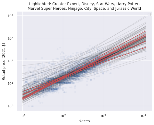
These notable themes have preditions close to the global average, which makes sense since they all have a fair number of sets, so the global mean is pulled towards their theme effects.
It has long been known in the quantitative social sciences that when naively modeled (as we have) that group-level effects (in this case theme-level effects), can strongly correlate with item-level covariates (in this case standardized log pieces). We now investigate whether our partially pooled model results in such a correlation.
First we calculate the average value of std_log_pieces within each theme.
theme_mean_std_log_pieces = (pd.Series(std_log_pieces, index=df.index)
                               .groupby(df["Theme"])
                               .mean())
ax = theme_mean_std_log_pieces.plot.hist(bins=20, lw=0., alpha=0.5)
ax.set_xlabel("Average standardized log pieces\nper set within theme");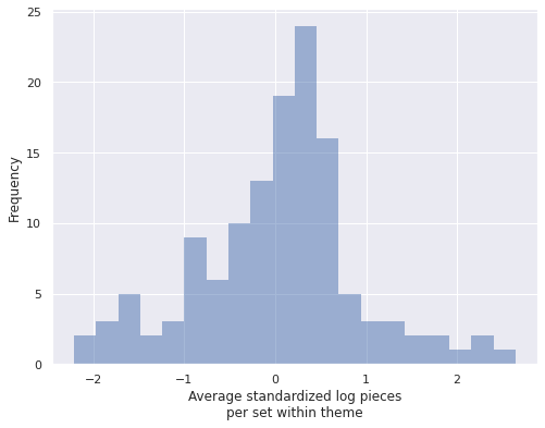
We see that these theme averages vary fairly widely. The following plots show the relationship between each theme’s average standardized log pieces and the posterior expected values of \(\beta_{0, j}\) and \(\beta_j\) respectively.
post_β0 = partial_trace["posterior"]["β0"].mean(dim=('chain', 'draw'))
post_β_pieces = partial_trace["posterior"]["β_pieces"].mean(dim=('chain', 'draw'))
fig, (β0_ax, β_pieces_ax) = plt.subplots(
ncols=2, sharex=True, sharey=False,
figsize=(15, 6)
)
β0_ax.scatter(theme_mean_std_log_pieces, post_β0);
β0_ax.set_xlabel("Average standardized log pieces\nper set within theme");
β0_ax.set_ylabel("Posterior expected\nvalue of $\\beta_0$");
β0_corr, β0_corr_p_val = sp.stats.pearsonr(
theme_mean_std_log_pieces.values,
post_β0
)
β0_ax.set_title(f"Correlation coefficient = {β0_corr:0.2f}\n"
f"Two-tailed p-value {β0_corr_p_val:.2e}");
β_pieces_ax.scatter(theme_mean_std_log_pieces, post_β_pieces);
β_pieces_ax.set_xlabel("Average standardized log pieces\nper set within theme");
β_pieces_ax.set_ylabel("Posterior expected\nvalue of $\\beta_{pieces}$");
β_pieces_corr, β_pieces_corr_p_val = sp.stats.pearsonr(
theme_mean_std_log_pieces.values,
post_β_pieces
)
β_pieces_ax.set_title(f"Correlation coefficient = {β_pieces_corr:0.2f}\n"
f"Two-tailed p-value {β_pieces_corr_p_val:.2e}");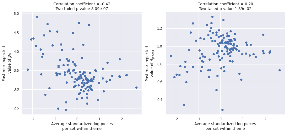
Both plots show highly significant correlations, with a stronger correlation between the theme average and the posterior expected average of \(\beta_{0, j}\). These correlations lead to violations of the Gauss-Markov assumptions in our regression design, so we remedy them with an expanded model in the next section.
Partially pooled mean model
Fortunately Bafumi and Gelman2 show how to remedy this violation by including the theme-level average standardized log pieces as a covariate in \(\beta_{0, j}\) and \(\beta_j\). if we denote the average standardized log pieces for sets in the \(j\)-th theme as \(\bar{\tilde{x}}_j\), in this extended model, \(\beta_{0, j}\) is defined as
\[ \begin{align*} \mu_{\beta_0}, \gamma_{\beta, 0} & \sim N(0, 2.5^2) \\ \sigma_{\beta_0} & \sim \textrm{HalfNormal}(2.5^2) \\ \beta_{0, j} & \sim N\left(\mu_{\beta_0} + \gamma_{\beta, 0} \cdot \bar{\tilde{x}}_j, \sigma_{\beta_0}^2\right), \end{align*} \]
and similarly for \(\beta_j\).
def hierarchical_normal_with_mean(name, x_mean, shape, μ=None):
    γ = pm.Normal(f"γ_{name}", 0., 2.5)

    return hierarchical_normal(name, shape, μ=μ) + γ * x_mean
with pm.Model() as mean_model:
σ = pm.HalfNormal("σ", 5.)
β0 = hierarchical_normal_with_mean(
"β0", at.constant(theme_mean_std_log_pieces),
n_theme
)
β_pieces = hierarchical_normal_with_mean(
"β_pieces", at.constant(theme_mean_std_log_pieces),
n_theme
)
μ = β0[theme_id_] + β_pieces[theme_id_] * std_log_pieces_ \
- 0.5 * σ**2
obs = pm.Normal("obs", μ, σ, observed=log_rrp2021)We now sample from this model.
std_log_pieces_.set_value(std_log_pieces)
theme_id_.set_value(theme_id)
with mean_model:
mean_trace = pm.sample(**SAMPLE_KWARGS)Auto-assigning NUTS sampler...
Initializing NUTS using jitter+adapt_diag...
Multiprocess sampling (3 chains in 3 jobs)
NUTS: [σ, γ_β0, μ_β0, Δ_β0, σ_β0, γ_β_pieces, μ_β_pieces, Δ_β_pieces, σ_β_pieces]100.00% [6000/6000 03:57<00:00 Sampling 3 chains, 0 divergences]
Sampling 3 chains for 1_000 tune and 1_000 draw iterations (3_000 + 3_000 draws total) took 239 seconds.
The number of effective samples is smaller than 10% for some parameters.
Once again the sampling diagnostics show no cause for concern.
make_diagnostic_plots(mean_trace);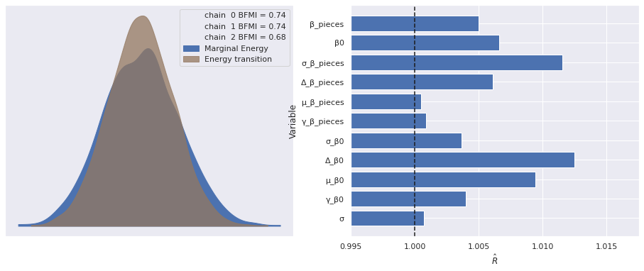
The correlations from above have disappeared in this model.
post_β0 = mean_trace["posterior"]["β0"].mean(dim=('chain', 'draw'))
post_β_pieces = mean_trace["posterior"]["β_pieces"].mean(dim=('chain', 'draw'))
fig, (β0_ax, β_pieces_ax) = plt.subplots(
ncols=2, sharex=True, sharey=False,
figsize=(15, 6)
)
β0_ax.scatter(theme_mean_std_log_pieces, post_β0);
β0_ax.set_xlabel("Average standardized log pieces\nper set within theme");
β0_ax.set_ylabel("Posterior expected\nvalue of $\\beta_0$");
β0_corr, β0_corr_p_val = sp.stats.pearsonr(
theme_mean_std_log_pieces.values,
post_β0
)
β0_ax.set_title(f"Correlation coefficient = {β0_corr:0.2f}\n"
f"Two-tailed p-value {β0_corr_p_val:.2f}");
β_pieces_ax.scatter(theme_mean_std_log_pieces, post_β_pieces);
β_pieces_ax.set_xlabel("Average standardized log pieces\nper set within theme");
β_pieces_ax.set_ylabel("Posterior expected\nvalue of $\\beta_{pieces}$");
β_pieces_corr, β_pieces_corr_p_val = sp.stats.pearsonr(
theme_mean_std_log_pieces.values,
post_β_pieces
)
β_pieces_ax.set_title(f"Correlation coefficient = {β_pieces_corr:0.2f}\n"
f"Two-tailed p-value {β_pieces_corr_p_val:.2f}");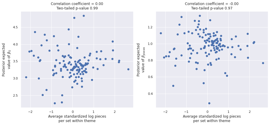
We add this model to our comparison.
traces["Partially pooled with mean"] = mean_tracecomp_df = az.compare(traces)comp_df.loc[:, :"weight"]| rank | loo | p_loo | d_loo | weight | |
|---|---|---|---|---|---|
| Partially pooled | 0 | -2315.578245 | 190.594364 | 0.000000 | 0.958583 |
| Partially pooled with mean | 1 | -2316.840059 | 187.512592 | 1.261814 | 0.000000 |
| Unpooled | 2 | -5133.311893 | 4.871287 | 2817.733648 | 0.041417 |
fig, ax = plt.subplots(figsize=(12, 6))

az.plot_compare(comp_df, plot_ic_diff=False, ax=ax);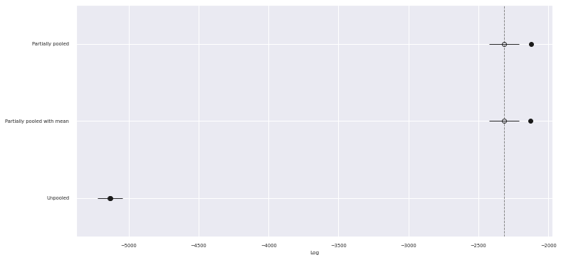
We see that the the PSIS-LOO scores of both partially pooled model are better than the pooled model and statistically indistinguishable from each other. Given these scores, we will work with the model that accounts for the theme’s average standardized log pieces going forward, since it satisfies the Gauss-Markov assumptions better.
The residuals from the two partially pooled models are also visually quite similar, though the second partial pooling model does have less pronounced diagonal bands.
with mean_model:
    pp_trace_data = pm.sample_posterior_predictive(mean_trace)

df["mean_resid"] = (log_rrp2021 - pp_trace_data["obs"]).mean(axis=0)
100.00% [3000/3000 00:01<00:00]
fig, axes = plt.subplots(ncols=2, sharex=True, sharey=True,
                         figsize=(14, 6))

sns.scatterplot(x="Pieces", y="pooled_resid", data=df,
                alpha=0.1, ax=axes[0]);

axes[0].set_xscale('log');
axes[0].set_xlabel("Pieces");

axes[0].set_ylabel("Log RRP residual (2021 $)");

axes[0].set_title("Partially pooled model");

sns.scatterplot(x="Pieces", y="mean_resid", data=df,
                alpha=0.1, ax=axes[1]);

axes[1].set_xscale('log');
axes[1].set_xlabel("Pieces");

axes[1].set_ylabel("Log RRP residual (2021 $)");

axes[1].set_title("Partially pooled mean model");

fig.tight_layout();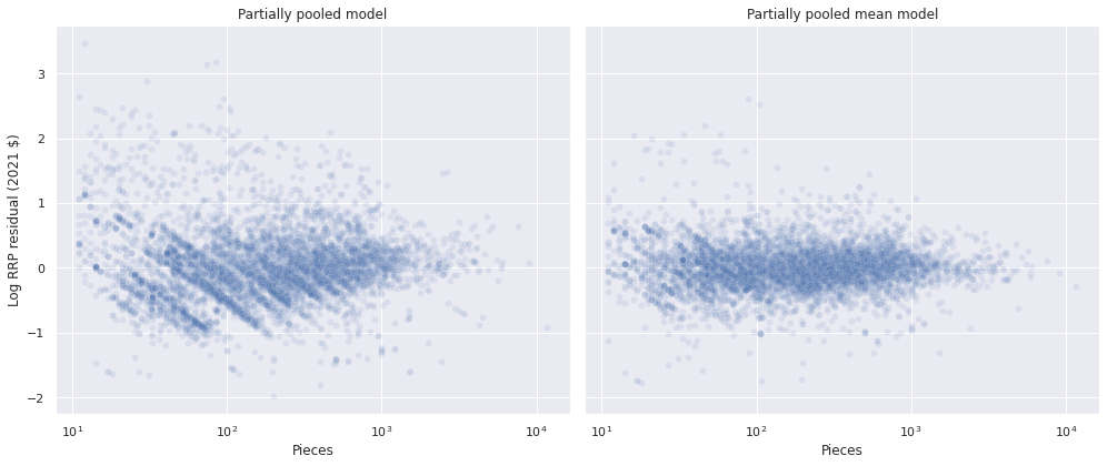
Interestingly, there is more variation in the varying intercepts (\(\beta_{0, j}\)) than the varying slopes (\(\beta_j\)), since \(\sigma_{\beta_0}\) has a larger posterior expected value than \(\sigma_{\beta}\).
az.plot_posterior(mean_trace,
                  var_names=[
                      "μ_β0", "μ_β_pieces",
                      "σ_β0", "σ_β_pieces"
                  ],
                  grid=(2, 2));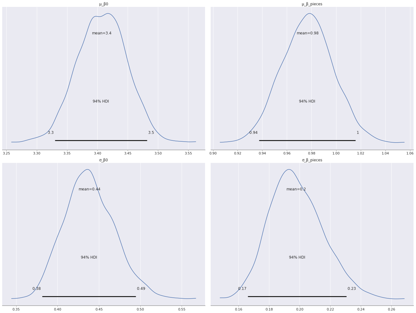
Plotting the residuals of log RRP in 2021 dollars versus time shows that the residuals for this model are significantly larger for sets between 1980 and 1995. This phenomenon makes sense as Lego has released many more sets per year after 1995 than in the initial period, so the estimates are dominated by the data in this later period.
ax = (df.groupby(level="Year released")
        ["mean_resid"]
        .mean()
        .plot(c='k', label="Year average"));

strip_ax = ax.twiny()
sns.stripplot(x="Year released", y="mean_resid",
              data=df.reset_index(),
              jitter=1.5,
              color='C0', alpha=0.1,
              ax=strip_ax);

strip_ax.set_axis_off();

ax.set_ylim(-2, 2);
ax.set_ylabel("Log RRP residual (2021 $)");

ax.legend(loc='upper left');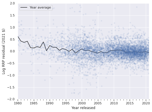
Time-varying model
We address this issue with the residuals by adding a time-varying component to \(\beta_0\). First we build t, which indicates the number of years after the data begins in 1980 that the set was released.
year = df.index.get_level_values("Year released").year.values
t = year - year.min()
t_ = shared(t)
n_year = int(t.max() + 1)
The prior on \(\beta_j\) stays the same as in the mean model, but we add a Gaussian random walk term, \(\beta_{0, t}\) to the intercept, \(\beta_0\). We use the priors
\[ \begin{align*} \mu_{\beta_{0, pieces}}, \gamma_{\beta_{0, pieces}} & \sim N(0, 2.5^2) \\ \sigma_{\beta_{0, pieces}} & \sim \textrm{HalfNormal}(2.5^2) \\ \Delta_{\beta_{0, i}} & \sim N(0, 0.25^2) \\ \beta_{0, t} & \sim \sum_{i = 1}^t \Delta_{\beta_{0, i}} \\ \beta_{0, j, t} & \sim N\left(\mu_{\beta_0} + \beta_{0, t} + \gamma_{\beta, 0} \cdot \bar{\tilde{x}}_j, \sigma_{\beta_0}^2\right). \end{align*} \]
We see that the time-varying factor \(\beta_{0, t}\) is constant across themes in order to reduce the computational burden when sampling from this model.
with pm.Model() as time_model:
    Δ_β0_t = pm.Normal("Δ_β0_t", 0., 0.25, shape=n_year)
    β0_t = pm.Deterministic("β0_t", Δ_β0_t.cumsum())

    β0_theme = hierarchical_normal_with_mean(
        "β0_theme", at.constant(theme_mean_std_log_pieces),
        n_theme
    )
    β0_i = β0_t[t_] + β0_theme[theme_id_]

    β_pieces = hierarchical_normal_with_mean(
        "β_pieces", at.constant(theme_mean_std_log_pieces),
        n_theme
    )

    σ = pm.HalfNormal("σ", 5.)
    μ = β0_i + β_pieces[theme_id_] * std_log_pieces_ - 0.5 * σ**2

    obs = pm.Normal("obs", μ, σ, observed=log_rrp2021)
We now sample from this model.
with time_model:
    time_trace = pm.sample(**SAMPLE_KWARGS)
Auto-assigning NUTS sampler...
Initializing NUTS using jitter+adapt_diag...
Multiprocess sampling (3 chains in 3 jobs)
NUTS: [Δ_β0_t, γ_β0_theme, μ_β0_theme, Δ_β0_theme, σ_β0_theme, γ_β_pieces, μ_β_pieces, Δ_β_pieces, σ_β_pieces, σ]100.00% [6000/6000 17:36<00:00 Sampling 3 chains, 0 divergences]
Sampling 3 chains for 1_000 tune and 1_000 draw iterations (3_000 + 3_000 draws total) took 1056 seconds.
The number of effective samples is smaller than 25% for some parameters.
Once again the sampling diagnostics show no cause for concern.
make_diagnostic_plots(time_trace);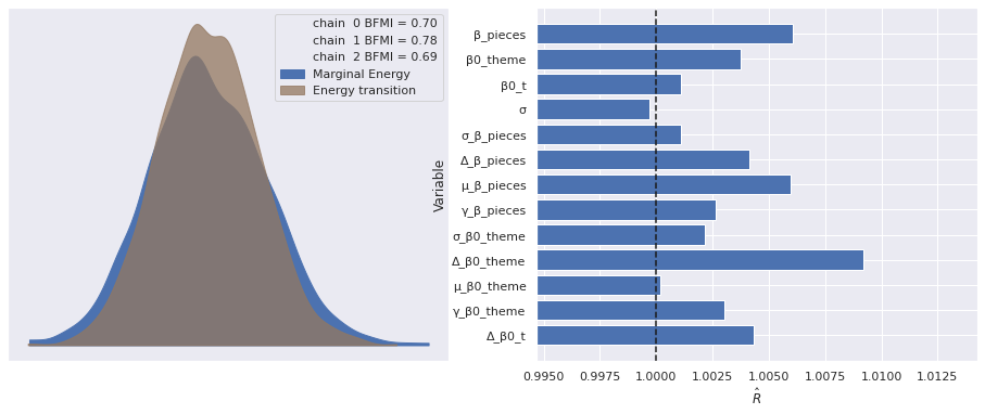
We see that the time-varying model performs noticeably better than the other models in terms of PSIS-LOO score.
traces["Partially pooled with mean and time"] = time_tracecomp_df = az.compare(traces)comp_df.loc[:, :"weight"]| rank | loo | p_loo | d_loo | weight | |
|---|---|---|---|---|---|
| Partially pooled with mean and time | 0 | -2058.373203 | 245.239325 | 0.000000 | 9.205189e-01 |
| Partially pooled | 1 | -2315.578245 | 190.594364 | 257.205042 | 4.565283e-02 |
| Partially pooled with mean | 2 | -2316.840059 | 187.512592 | 258.466855 | 1.857221e-12 |
| Unpooled | 3 | -5133.311893 | 4.871287 | 3074.938690 | 3.382830e-02 |
fig, ax = plt.subplots(figsize=(12, 6))

az.plot_compare(comp_df, plot_ic_diff=False, ax=ax);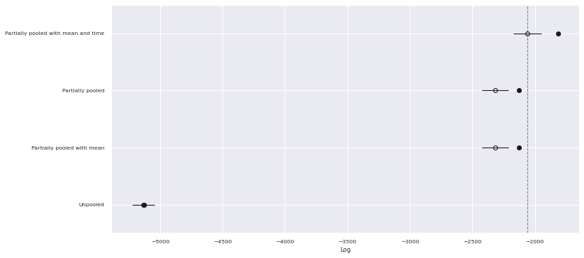
The residuals for this model are similar to those of the previous one when plotted against the number of pieces in the set.
with time_model:
    pp_time_data = pm.sample_posterior_predictive(time_trace)

df["time_resid"] = (log_rrp2021 - pp_time_data["obs"]).mean(axis=0)
100.00% [3000/3000 00:02<00:00]
fig, axes = plt.subplots(ncols=2, sharex=True, sharey=True,
                         figsize=(14, 6))

sns.scatterplot(x="Pieces", y="mean_resid", data=df,
                alpha=0.1, ax=axes[0]);

axes[0].set_xscale('log');
axes[0].set_xlabel("Pieces");

axes[0].set_ylabel("Log RRP residual (2021 $)");

axes[0].set_title("Partially pooled mean model");

sns.scatterplot(x="Pieces", y="time_resid", data=df,
                alpha=0.1, ax=axes[1]);

axes[1].set_xscale('log');
axes[1].set_xlabel("Pieces");

axes[1].set_ylabel("Log RRP residual (2021 $)");

axes[1].set_title("Partially pooled mean model with time");

fig.tight_layout();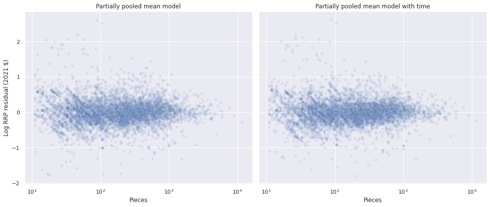
The following plot shows that this model has significantly reduced the amount of time-dependence in the residuals.
ax = (df.groupby(level="Year released")
        ["time_resid"]
        .mean()
        .plot(c='k', label="Year average"));

strip_ax = ax.twiny()
sns.stripplot(x="Year released", y="time_resid",
              data=df.reset_index(),
              jitter=1.5,
              color='C0', alpha=0.1,
              ax=strip_ax);

strip_ax.set_axis_off();

ax.set_ylim(-2, 2);
ax.set_ylabel("Log RRP residual (2021 $)");

ax.legend(loc='upper left');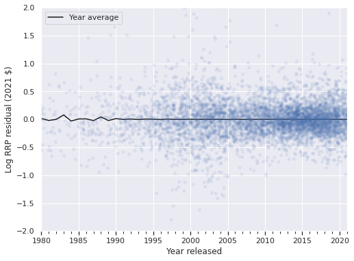
Again, there is more variation in the varying intercepts (\(\beta_{0, j}\)) than the varying slopes (\(\beta_j\)), since \(\sigma_{\beta_0}\) has a larger posterior expected value than \(\sigma_{\beta}\).
az.plot_posterior(time_trace,
                  var_names=[
                      "μ_β0_theme", "μ_β_pieces",
                      "σ_β0_theme", "σ_β_pieces"
                  ],
                  grid=(2, 2));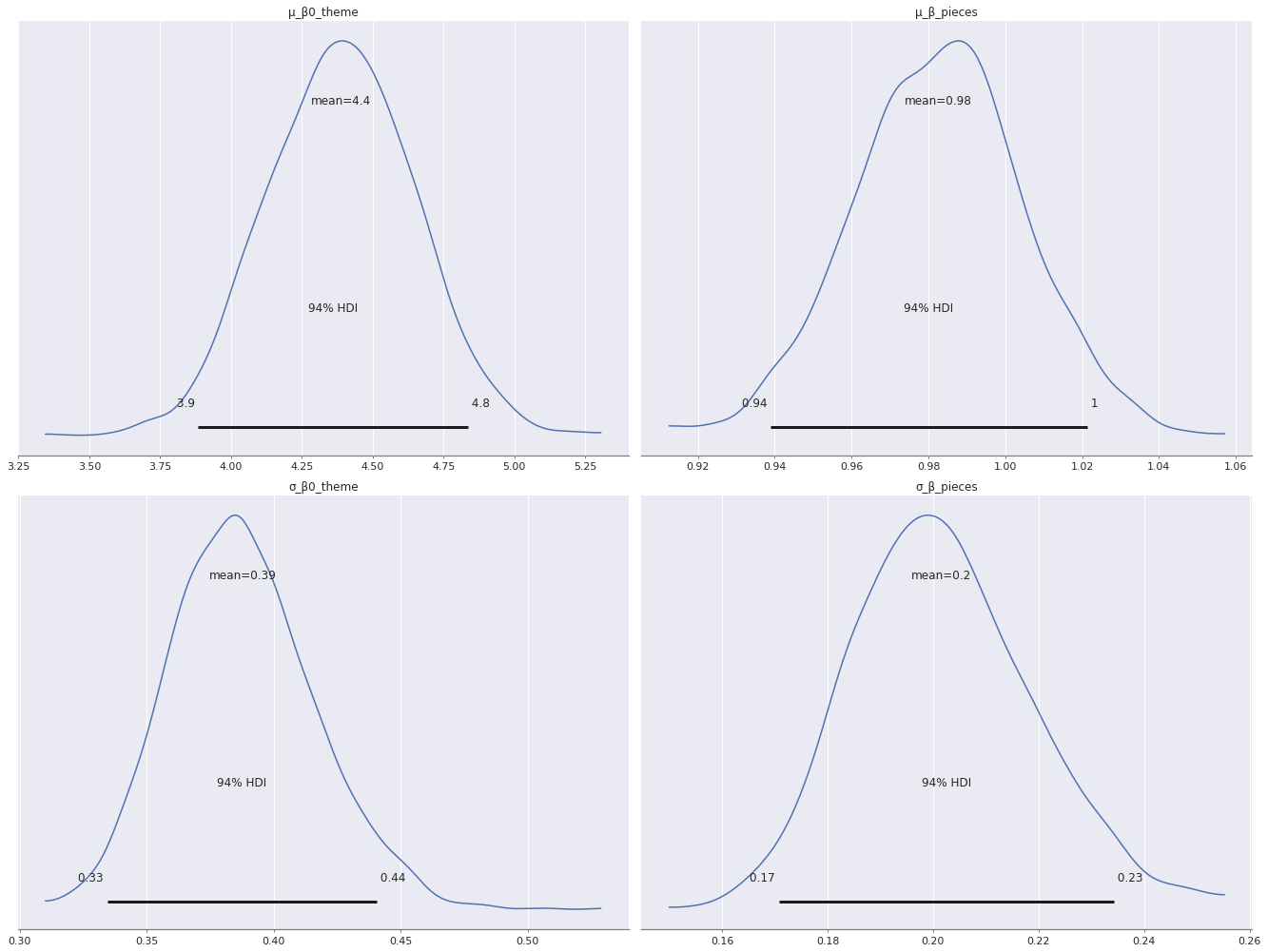
We now revisit the question of whether or not Darth Vader’s Meditation Chamber is fairly priced. In the previous post in this series, we compared the price per piece of this set to all sets, all Star Wars sets, and all sets currently in my collection. We found that it was in or near the first quartile of price per piece among all sets and Star Wars sets, and near the median priece per piece in my collection. With this model in hand, we can ask where the adjusted recommended retail price falls in the predicted distribution of posterior predicted prices for a Star Wars set with 663 pieces.
VADER_MEDITATION = "75296-1"

vader_info = df.xs(VADER_MEDITATION, level="Set number")
vader_iloc = (df.index
                .get_level_values("Set number")
                .isin([VADER_MEDITATION])
.argmax())(vader_info["RRP2021"].values[0] \
>= np.exp(pp_trace_data["obs"][:, vader_iloc])).mean()0.2816666666666667The set falls in towards the bottom of the second quartile of predicted prices for such a set, which is consistent with the empirical price per piece analysis of the previous post. This model can also answer some counterfactual questions about my collection. We see that my sets are highly concentrated in the Star Wars theme, with a smattering of other themes represented as well.
(df[df["austin"] == True]
   ["Theme"]
   .value_counts(ascending=True)
   .plot.barh());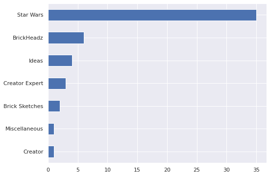
This preponderance of Star Wars sets is even stronger than it initially appears because all but one of my BrickHeadz sets are Star Wars characters. The single exception are the adorable German Shepherds (40440).

In particular, we can compare the actual cost of my collection to the predicted expected cost of my collection conditioned on the piece count and theme of the sets.
coll_value = (df[df["austin"] == True]
                ["RRP2021"]
.sum())coll_value3206.3933684401236(np.exp(pp_trace_data["obs"])
[:, df["austin"] == True]
.mean(axis=0)
.sum())3826.537853977332So my collection cost about 20% less than expected conditioned on piece count and theme. (This figure actually understates my frugality as I have received several sets as gifts, notably the massive Super Star Destroyer (10221).) We can easily check where my collection’s actual value falls in the posterior predictive distribution of its possible values.
pp_coll_value = (np.exp(pp_trace_data["obs"])
                   [:, df["austin"] == True]
                   .sum(axis=1))
ax, = (sns.displot(pp_coll_value, kind='kde',
height=6, aspect=8 / 6,
label="Posterior predictive distribution")
.axes.flatten())
ax.axvline(coll_value, c='k', ls='--',
label="Actual value");
ax.xaxis.set_major_formatter(dollar_formatter);
ax.set_xlabel("Collection value (2021 $)");
ax.set_yticks([]);
ax.legend(loc='upper right');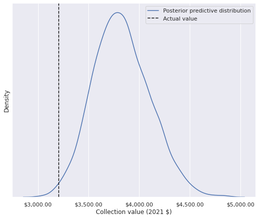
(coll_value > pp_coll_value).mean()0.007My collection’s actual value is in the first percentile of the posterior predictive distribution of possible collection values; according to this model, I really am quite cheap!
It is worth noting that in this post we have modeled log price directly, not price per piece as in the last model. Those familiar with offset terms in offsets in generalizedl linear models will notice that the model we have specified can be equivalent to an model of (log) price per piece if we fix \(\beta_j = 1\), since \(\log\left(\frac{x}{y}\right) = \log x - \log y.\) The following plot shows how far outside the high density area of the posterior distribution of \(\mu_{\beta_0}\) the value one is.
az.plot_posterior(time_trace, var_names=["μ_β0_theme"], ref_val=1.);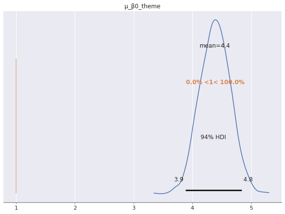
Due to this fact, we prefer to model (log) price directly over using an offset model that includes (log) piece count on both sides of the equal sign.
Future posts will explore further inferences from this model and develop extended models using other attributes of each set available via Brickset.
This post is available as a Jupyter notebook here.
%load_ext watermark
%watermark -n -u -v -iv
Last updated: Thu Jun 10 2021
Python implementation: CPython
Python version : 3.8.8
IPython version : 7.22.0
pandas : 1.2.3
aesara : 2.0.10
pymc3 : 4.0
scipy : 1.6.2
seaborn : 0.11.1
matplotlib: 3.4.1
arviz : 0.11.2
numpy : 1.20.2Vehtari, A., Gelman, A., & Gabry, J. (2017). Practical Bayesian model evaluation using leave-one-out cross-validation and WAIC. (PSIS-LOO) to compare them.) Statistics and computing, 27(5), 1413-1432.↩︎
Bafumi, J., & Gelman, A. E. (2006). Fitting multilevel models when predictors and group effects correlate.↩︎