Modeling Shark Attacks in Python with PyMC3
On a recent visit to Cape May, New Jersey I bought and read Shark Attacks of the Jersey Shore: A History, which is an interesting account of verified shark attacks in New Jersey since the nineteenth century.

While I was reading the book, I grew curious about modeling the frequency of shark attacks and went on the hunt for relevant data. There have not been many recent shark attacks in New Jersey, so I broadened my search and found the Global Shark Attack File (GSAF). The GSAF provides a fairly detailed incident log which appears to be updated every few days. This post presents an analysis of the GSAF data in Python using PyMC3. (It is worth mentioning that I am not a shark biologist, and I am sure specialists have produced much more useful and accurate models of shark attacks. Still, this seems like a fun small project as long as we don’t take the results too seriously.)
First we make some Python imports and do a bit of housekeeping.
%matplotlib inlinefrom functools import reduce
from warnings import filterwarningsfrom aesara import tensor as at
import arviz as az
from matplotlib import pyplot as plt
import numpy as np
import pandas as pd
import pymc3 as pm
import seaborn as sns
import usYou are running the v4 development version of PyMC3 which currently still lacks key features. You probably want to use the stable v3 instead which you can either install via conda or find on the v3 GitHub branch: https://github.com/pymc-devs/pymc3/tree/v3filterwarnings('ignore', category=UserWarning, module='aesara')
filterwarnings('ignore', category=UserWarning, module='arviz')
filterwarnings('ignore', category=UserWarning, module='pandas')plt.rcParams['figure.figsize'] = (8, 6)
sns.set(color_codes=True)Load and Transform the Data
We begin by downloading the data from the GSAF and loading the relevant columns into a Pandas data frame.
%%bash
DATA_URL=http://www.sharkattackfile.net/spreadsheets/GSAF5.xls
DATA_DEST=./data/GSAF5.xls

if [[ ! -e $DATA_DEST ]];
then
    wget -q -O $DATA_DEST $DATA_URL
fi
full_df = pd.read_excel('./data/GSAF5.xls',
usecols=[
"Case Number", "Date", "Type",
"Country", "Area", "Location",
"Fatal (Y/N)"
],
index_col="Case Number")
full_df["Date"] = full_df["Date"].apply(pd.to_datetime, errors='coerce')full_df.head()| Date | Type | Country | Area | Location | Fatal (Y/N) | |
|---|---|---|---|---|---|---|
| Case Number | ||||||
| 2021.06.14.b | 2021-06-14 | Unprovoked | USA | Florida | New Smyrna Beach, Volusia County | N |
| 2021.06.14.a | 2021-06-14 | Unprovoked | USA | Florida | New Smyrna Beach, Volusia County | N |
| 2021.06.12 | 2021-06-12 | Provoked | ENGLAND | West Sussex | Littlehampton | N |
| 2021.06.11 | 2021-06-11 | Unprovoked | AUSTRALIA | Western Australia | Five Fingers Reef | N |
| 2021.05.23 | 2021-05-23 | Unprovoked | USA | South Carolina | Burkes Beach, Hilton Head, Beaufort County | N |
full_df.tail()| Date | Type | Country | Area | Location | Fatal (Y/N) | |
|---|---|---|---|---|---|---|
| Case Number | ||||||
| NaN | NaT | NaN | NaN | NaN | NaN | NaN |
| NaN | NaT | NaN | NaN | NaN | NaN | NaN |
| NaN | NaT | NaN | NaN | NaN | NaN | NaN |
| NaN | NaT | NaN | NaN | NaN | NaN | NaN |
| xx | NaT | NaN | NaN | NaN | NaN | NaN |
We can already see by inspecting the data frame that there will be quite a bit of missing data to handle.
full_df.index.isnull().mean()0.6595373706846449full_df.isnull().mean()Date 0.775621
Type 0.742880
Country 0.744391
Area 0.760587
Location 0.763726
Fatal (Y/N) 0.763842
dtype: float64We begin by filtering out rows with missing data in important columns.
FILTERS = [
    ~full_df.index.isnull(),
    ~full_df["Date"].isnull(),
    ~full_df["Type"].isnull()
](full_df[reduce(np.logical_and, FILTERS)]
.isnull()
.mean())Date 0.000000
Type 0.000000
Country 0.004843
Area 0.052413
Location 0.061927
Fatal (Y/N) 0.079398
dtype: float64We see now that there is significantly less missing data, so we proceed to examine various aspects of the data.
ax = (full_df[reduce(np.logical_and, FILTERS)]
             ["Type"]
             .value_counts()
             .plot(kind='barh'))

ax.set_xscale('log');
ax.set_xlabel("Number of attacks");

ax.invert_yaxis();
ax.set_ylabel("Type of attack");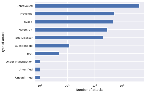
Unprovoked attacks are by far the most common. We will focus our analysis on this type of attack.
FILTERS.append(full_df["Type"] == "Unprovoked")ax = (full_df[reduce(np.logical_and, FILTERS)]
["Country"]
.value_counts()
.plot(kind='barh', figsize=(8, 30)))
ax.set_xscale('log');
ax.set_xlabel("Number of unprovoked attacks");
ax.invert_yaxis();
ax.set_ylabel("Country");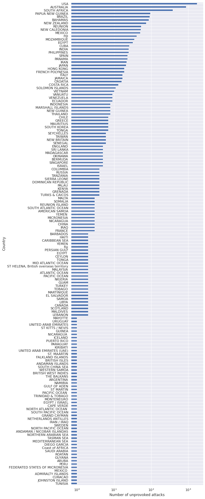
While the data contain information about attacks in many countries, we will focus on the United States. This focus is due partially to the fact that I was in New Jersey when considering this problem, and partially due to the fact that finding standardized data across countries can be more challenging than within different regions of a single country.
FILTERS.append(full_df["Country"] == "USA")ax = (full_df[reduce(np.logical_and, FILTERS)]
["Area"]
.value_counts()
.plot(kind='barh', figsize=(8, 12)))
ax.set_xscale('log');
ax.set_xlabel("Number of unprovoked attacks");
ax.invert_yaxis();
ax.set_ylabel("Country");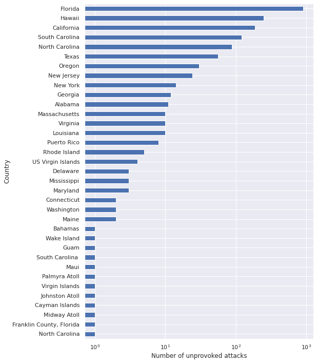
We see that for unprovoked attacks in the United States, Area roughly corresponds to state, with some territories included as well. Since most of the territories appear very rarely, we restrict our analysis to states so that it is easier to find information about them.
FILTERS.append(
full_df["Area"].isin([
state.name for state in us.states.STATES
])
)
Finally we look at how the number of shark attacks has changed over time.
ax = (full_df.assign(Year=full_df["Date"].dt.year)
             [reduce(np.logical_and, FILTERS)]
             ["Year"]
             .value_counts()
             .sort_index()
             .plot())

ax.set_xlabel("Year");
ax.set_ylabel("Unprovoked shark attacks\nin the United States");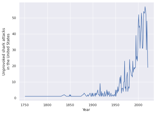
We see that the number of shark attacks has increased over time. This phenomenon is likely partially due to population growth and partially due to improved reporting mechanisms for shark attacks. We willk keep a relatively modern focus an analysze shark attacks between 1960 and 2020.
YEAR_RANGE = (1960, 2020)

FILTERS.append(full_df["Date"].dt.year.between(*YEAR_RANGE))
Now that we have defined the set of attacks we will model, we produce another data frame including only these attacks and make some light transformations of the data.
df = (full_df[reduce(np.logical_and, FILTERS)]
             .copy()
             .rename(columns={"Area": "State"}))
df["Year"] = df["Date"].dt.yeardf.head()| Date | Type | Country | State | Location | Fatal (Y/N) | Year | |
|---|---|---|---|---|---|---|---|
| Case Number | |||||||
| 2020.12.30 | 2020-12-30 | Unprovoked | USA | California | Coronado, San Diego County | N | 2020 |
| 2020.12.08 | 2020-12-08 | Unprovoked | USA | Hawaii | Honolua Bay | Y | 2020 |
| 2020.12.06.b | 2020-12-06 | Unprovoked | USA | Oregon | Seaside Cove, Clatsop County | N | 2020 |
| 2020.11.26 | 2020-11-26 | Unprovoked | USA | Hawaii | Maui | N | 2020 |
| 2020.10.31 | 2020-10-31 | Unprovoked | USA | Florida | Ormond Beach | N | 2020 |
df.tail()| Date | Type | Country | State | Location | Fatal (Y/N) | Year | |
|---|---|---|---|---|---|---|---|
| Case Number | |||||||
| 1904.00.00.a | 1970-01-01 00:00:00.000001904 | Unprovoked | USA | Hawaii | Off Diamond Head, Honolulu, O’ahu | Y | 1970 |
| 1896.00.00.b | 1970-01-01 00:00:00.000001896 | Unprovoked | USA | Florida | NaN | Y | 1970 |
| 1883.00.00.a | 1970-01-01 00:00:00.000001883 | Unprovoked | USA | South Carolina | NaN | Y | 1970 |
| 1882.00.00.b | 1970-01-01 00:00:00.000001882 | Unprovoked | USA | Florida | In the bay near the naval yard at Pensacola, E… | N | 1970 |
| 1852.00.00 | 1970-01-01 00:00:00.000001852 | Unprovoked | USA | South Carolina | Mount Pleasant, Charleston County | Y | 1970 |
df.shape(1514, 7)After applying these filters, just over 1,500 attacks remain. This analysis will focus on the number of shark attacks in a state in a given year. Subsequent posts may analyze other aspects of this data. First we count the number of attacks in a given state in a given year. (We will shorten the phrase “unprovoked shark attacks in the United States between 1960 and 2020” to “attacks” for the remainder of the post.)
attacks_nz = (df.groupby(["State", "Year"])
                .size()
.rename("Attacks"))attacks_nz.describe()count 333.000000
mean 4.546547
std 6.527174
min 1.000000
25% 1.000000
50% 2.000000
75% 5.000000
max 38.000000
Name: Attacks, dtype: float64The series attacks_nz includes a row only when there was at least one attack in that state in that year. We also want to include zero entries for state/year combinations that saw now attacks, which we do now by reindexing attacks_nz.
attacks_index = (pd.MultiIndex.from_product((
                        attacks_nz.index
                                  .get_level_values("State")
                                  .unique(),
                        YEAR_RANGE[0] + np.arange(attacks_nz.index
                                                            .get_level_values("Year")
                                                            .values
                                                            .ptp())))
                   .rename("Year", level=1))
attacks_df = (attacks_nz.reindex(attacks_index, fill_value=0)
                        .astype(np.int64)
.to_frame())attacks_df.head()| Attacks | ||
|---|---|---|
| State | Year | |
| Alabama | 1960 | 0 |
| 1961 | 0 | |
| 1962 | 0 | |
| 1963 | 0 | |
| 1964 | 0 |
attacks_df.tail()| Attacks | ||
|---|---|---|
| State | Year | |
| Washington | 2015 | 0 |
| 2016 | 0 | |
| 2017 | 1 | |
| 2018 | 0 | |
| 2019 | 0 |
Modeling
We now turn to modeling the data.
ax = attacks_df["Attacks"].hist(bins=attacks_df["Attacks"].max() + 1)

ax.set_xlabel("Number of attacks");

ax.set_yscale('log');
ax.set_ylabel("Number of state-years");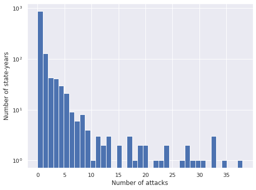
We see that the vast majority of state-years have no shark attacks, and that when there is at least one attack, there are rarely very many. We see that the index of dispersion is significantly larger than one, so the data shows overdispersion.
attacks_df.var() / attacks_df.mean()Attacks 12.729978
dtype: float64Negative Binomial
Due to this overdispersion, we begin with a Negative Binomial model.
Let \(y_{i, t}\) represent the number of attacks in the \(i\)-th state in year \(t\). We use the priors
\[ \begin{align*} \mu & \sim \operatorname{Lognormal}(0, 2.5^2) \\ \alpha & \sim \operatorname{Half}-N(2.5^2). \end{align*} \]
with pm.Model() as nb_model:
    μ = pm.Lognormal("μ", 0., 2.5)
    α = pm.HalfNormal("α", 2.5)
We now let \(y_{i, t} \sim NB(\mu, \alpha)\)
y = attacks_df["Attacks"].valueswith nb_model:
obs = pm.NegativeBinomial("obs", μ, α, observed=y)We use pymc3 to sample from the posterior distribution of this model.
CHAINS = 3
SEED = 12345

SAMPLE_KWARGS = {
    'cores': CHAINS,
    'random_seed': [SEED + i for i in range(CHAINS)],
    'return_inferencedata': True
}
with nb_model:
nb_trace = pm.sample(**SAMPLE_KWARGS)Auto-assigning NUTS sampler...
Initializing NUTS using jitter+adapt_diag...
Multiprocess sampling (3 chains in 3 jobs)
NUTS: [μ, α]100.00% [6000/6000 00:15<00:00 Sampling 3 chains, 0 divergences]
Sampling 3 chains for 1_000 tune and 1_000 draw iterations (3_000 + 3_000 draws total) took 20 seconds.The standard sampling diagnostics (energy plots, BFMI, and \(\hat{R}\)) show no cause for concern.
def make_diagnostic_plots(trace, axes=None, min_mult=0.995, max_mult=1.005):
    if axes is None:
        fig, axes = plt.subplots(ncols=2,
                                 sharex=False, sharey=False,
                                 figsize=(16, 6))

    az.plot_energy(trace, ax=axes[0])


    rhat = az.rhat(trace).max()
    axes[1].barh(np.arange(len(rhat.variables)), rhat.to_array(),
                 tick_label=list(rhat.variables.keys()))
    axes[1].axvline(1, c='k', ls='--')

    axes[1].set_xlim(
        min_mult * min(rhat.min().to_array().min(), 1),
        max_mult * max(rhat.max().to_array().max(), 1)
    )
    axes[1].set_xlabel(r"$\hat{R}$")

    axes[1].set_ylabel("Variable")

return fig, axesmake_diagnostic_plots(nb_trace);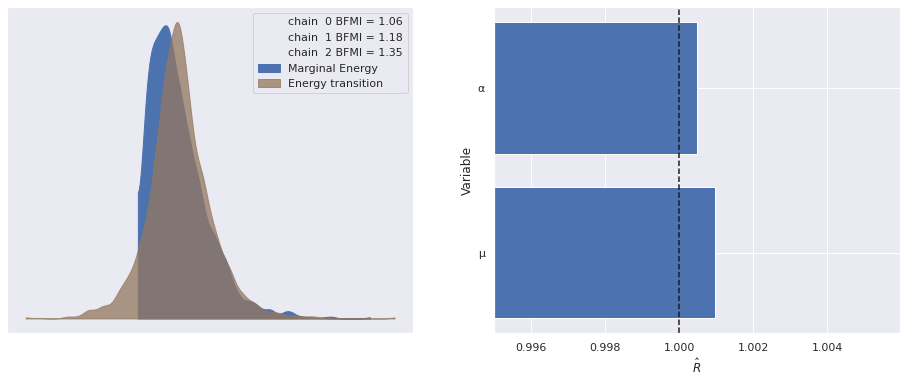
Examining the posterior distribution for \(\mu\) shows that the model will predicts more than one shark attack per year on average.
az.plot_posterior(nb_trace, var_names=["μ"]);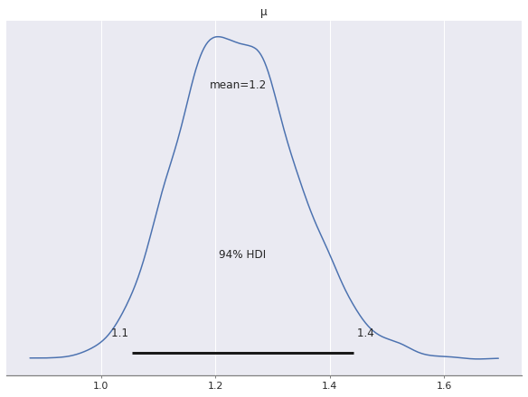
This prediction of about one shark attack per state per year captures nationwide average well enough, but is clearly not very useful at the state level. We see specifically how bad it is by examining the posterior predictions of the model.
with nb_model:
    nb_pp_trace = pm.sample_posterior_predictive(nb_trace)
100.00% [3000/3000 00:05<00:00]
First we produce a long data frame where each row represents a single posterior predictive sample from the distribution of the number of attacks in a given state-year. This data frame will be the basis for all of our posterior predictive plots.
def make_pp_full_df(pp_obs):
    return (pd.DataFrame(
                {i: samples for i, samples in enumerate(pp_obs)},
                index=attacks_df.index
              )
              .reset_index()
              .melt(id_vars=["State", "Year"],
                    var_name="Sample")
              .set_index(["State", "Year", "Sample"]))
nb_pp_full_df = make_pp_full_df(nb_pp_trace["obs"])nb_pp_full_df.head()| value | |||
|---|---|---|---|
| State | Year | Sample | |
| Alabama | 1960 | 0 | 1 |
| 1961 | 0 | 0 | |
| 1962 | 0 | 0 | |
| 1963 | 0 | 0 | |
| 1964 | 0 | 0 |
ALPHA = 0.05def summarize_pp_df(pp_full_df, level=None, alpha=ALPHA):
if level is None:
level = ["State", "Year"]
return (pp_full_df.groupby(level=level)
["value"]
.agg(
mean='mean',
sum='sum',
low=lambda s: s.quantile(alpha / 2.),
high=lambda s: s.quantile(1. - alpha / 2.),
)
.assign(attacks=attacks_df["Attacks"]
.groupby(level=level)
.sum()))nb_pp_df = summarize_pp_df(nb_pp_full_df)nb_pp_df.head()| mean | sum | low | high | attacks | ||
|---|---|---|---|---|---|---|
| State | Year | |||||
| Alabama | 1960 | 1.231000 | 3693 | 0 | 12.000 | 0 |
| 1961 | 1.212667 | 3638 | 0 | 12.000 | 0 | |
| 1962 | 1.206000 | 3618 | 0 | 11.025 | 0 | |
| 1963 | 1.232000 | 3696 | 0 | 12.000 | 0 | |
| 1964 | 1.177667 | 3533 | 0 | 11.000 | 0 |
The data frame nb_pp_df contains the posterior predictive mean and posterior predictive quantiles for each state-year combination. We now plot the predictions and actual data, broken down by state.
def plot_pp_over_time(data=None, y="mean", *args, **kwargs):
    pp_df = data

    ax = plt.gca()
    (pp_df.plot("Year", y,
                c='k', label="Posterior expected value",
                ax=ax))
    (pp_df.reset_index()
          .plot("Year", "attacks",
                kind='scatter', c='k', zorder=5,
                label="Actual", ax=ax))

    ax.fill_between(pp_df["Year"], pp_df["low"], pp_df["high"],
                    color='C0', alpha=0.5,
                    label="95% posterior credible interval")

    ax.set_ylabel("Number of shark attacks")

    return ax
grid = sns.FacetGrid(nb_pp_df.reset_index(), col="State",
col_wrap=2, sharey=False, aspect=1.5)
grid.map_dataframe(plot_pp_over_time);
grid.axes[0].legend(loc="upper left");
grid.set_titles("{col_name}");
grid.fig.tight_layout();
We see that the predictions for each state are indeed the same (ignoring some slight Monte Carlo variation), and therefore vastly overpredict shark attacks for most states while massively underpredicting shark attacks for some states.
The plot below which does not include a time axis further reinforces this point.
nb_pp_state_df = summarize_pp_df(nb_pp_full_df, level="State")
ax = (nb_pp_state_df.reset_index()
                    .plot.scatter("mean", "State", color='C0',
                                  xerr=nb_pp_state_df[["low", "high"]]
                                                     .sub(nb_pp_state_df["mean"],
                                                          axis=0)
                                                     .abs()
                                                     .values.T,
                                  zorder=5,
                                  label="Posterior predictive mean"))
(attacks_df.reset_index()
           .plot.scatter("Attacks", "State",
                         color='k', alpha=0.5,
                         label="Actual", ax=ax));

ax.set_xlabel("Number of shark Attacks");
ax.invert_yaxis();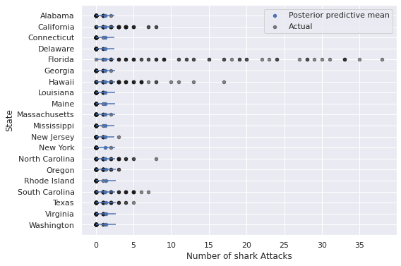
The predictions from this model are particularly bad for states like California, Florida, Hawaii, and the Carolinas, where years with many shark attacks are relatively more common than they are for other states.
Negative Binomial Regression
California, Florida, and to a lesser extent the Carolinas are similar in that they have relatively large populations. All of these states are similar in that their population is relatively concentrated on the coast.
The table below shows that overdispersion is still quite prevalent when we condition on state, so will use negative binomial regression to account for the effect of state-level factors on the number of attacks.
(attacks_df.groupby(level="State")
           .var()
           .div(attacks_df.groupby("State")
.mean()))| Attacks | |
|---|---|
| State | |
| Alabama | 1.090395 |
| California | 1.408464 |
| Connecticut | 1.000000 |
| Delaware | 0.966102 |
| Florida | 8.373881 |
| Georgia | 1.090395 |
| Hawaii | 3.457544 |
| Louisiana | 0.915254 |
| Maine | 1.000000 |
| Massachusetts | 1.254237 |
| Mississippi | 1.000000 |
| New Jersey | 1.457627 |
| New York | 2.000000 |
| North Carolina | 2.342930 |
| Oregon | 1.156634 |
| Rhode Island | 1.000000 |
| South Carolina | 2.382694 |
| Texas | 1.917465 |
| Virginia | 0.881356 |
| Washington | 0.983051 |
First we load state-leve population and coastline data from Wikipedia.
POP_URL = "https://en.wikipedia.org/wiki/List_of_U.S._states_and_territories_by_historical_population"

population = (pd.read_html(POP_URL)[3]
                .iloc[:-1]
                .melt(id_vars="Name",
                      var_name="Year",
                      value_name="Population")
                .rename(columns={"Name": "State"})
                .fillna(0)
                .astype({
                    "Year": np.int64,
                    "Population": np.float64
                })
                .set_index(["State", "Year"])
                .sort_index()
["Population"])population.head()State Year
Alabama 1960 3266740.0
1970 3444165.0
1980 3893888.0
1990 4040587.0
2000 4447100.0
Name: Population, dtype: float64population.tail()State Year
Wyoming 1980 469557.0
1990 453588.0
2000 493782.0
2010 563626.0
2020 576851.0
Name: Population, dtype: float64The series population contains the population of each state according to the United States census conducted every ten years.
COAST_URL = "https://en.wikipedia.org/wiki/List_of_U.S._states_and_territories_by_coastline"

coast_df, _ = pd.read_html(COAST_URL)
coast_df = (coast_df[["State or territory", "Method 1 (CRS)", "Coast/area ratio (ft/mi2)"]]
                    .iloc[:-1])
coast_df.columns = coast_df.columns.droplevel(0)
coast_df = coast_df.drop(["Rank", "Method 2"], axis=1)
coast_df = (coast_df.rename(columns={
                        "State or territory": "State",
                        "Method 1": "Coastline to area"
                    })
                    .set_index("State")
.sort_index())coast_df.head()| Coastline | Coastline to area | |
|---|---|---|
| State | ||
| Alabama | 53 mi (85 km) | 5.3 |
| Alaska | 6,640 mi (10,690 km) | 53 |
| American Samoa | – | – |
| California | 840 mi (1,350 km) | 27 |
| Connecticut | 96 mi (154 km) | 91 |
coast_df["Coastline"] = (
    coast_df["Coastline"]
            .str.split(expand=True)
            .iloc[:, 0]
            .str.replace(",", "")
            .str.replace("[–—]", "0", regex=True)
            .astype(np.float64)
)
coast_df["Coastline to area"] = (
    coast_df["Coastline to area"]
            .astype(str)
            .str.replace("[–—]", "-1", regex=True)
            .astype(np.float64)
            .replace(-1, np.nan)
)coast_df.head()| Coastline | Coastline to area | |
|---|---|---|
| State | ||
| Alabama | 53.0 | 5.3 |
| Alaska | 6640.0 | 53.0 |
| American Samoa | 0.0 | NaN |
| California | 840.0 | 27.0 |
| Connecticut | 96.0 | 91.0 |
coast_df.tail()| Coastline | Coastline to area | |
|---|---|---|
| State | ||
| U.S. Minor Outlying Islands | 0.0 | NaN |
| U.S. Virgin Islands | 0.0 | NaN |
| Virginia | 112.0 | 14.0 |
| Washington | 157.0 | 12.0 |
| Wisconsin | 0.0 | NaN |
The data frame coast_df contains the length of a state’s coastline (in miles) as well as the ratio of its coastline to area (in square miles).
We now combine attacks, population, and coast_df into a single data frame.
attacks_df = (attacks_df.merge(coast_df,
                               left_index=True, right_index=True)
                        .merge(population, how='left',
                               left_index=True, right_index=True)
.fillna(method='ffill'))attacks_df["Population to coastline"] = attacks_df["Population"] / attacks_df["Coastline"]attacks_df.head()| Attacks | Coastline | Coastline to area | Population | Population to coastline | ||
|---|---|---|---|---|---|---|
| State | Year | |||||
| Alabama | 1960 | 0 | 53.0 | 5.3 | 3266740.0 | 61636.603774 |
| 1961 | 0 | 53.0 | 5.3 | 3266740.0 | 61636.603774 | |
| 1962 | 0 | 53.0 | 5.3 | 3266740.0 | 61636.603774 | |
| 1963 | 0 | 53.0 | 5.3 | 3266740.0 | 61636.603774 | |
| 1964 | 0 | 53.0 | 5.3 | 3266740.0 | 61636.603774 |
attacks_df.tail()| Attacks | Coastline | Coastline to area | Population | Population to coastline | ||
|---|---|---|---|---|---|---|
| State | Year | |||||
| Washington | 2015 | 0 | 157.0 | 12.0 | 6724540.0 | 42831.464968 |
| 2016 | 0 | 157.0 | 12.0 | 6724540.0 | 42831.464968 | |
| 2017 | 1 | 157.0 | 12.0 | 6724540.0 | 42831.464968 | |
| 2018 | 0 | 157.0 | 12.0 | 6724540.0 | 42831.464968 | |
| 2019 | 0 | 157.0 | 12.0 | 6724540.0 | 42831.464968 |
Here the population data is from the most recent United States census prior to the year in question (thanks to fillna(method='ffill'). Below we plot the relationship between the four explanatory variables and the number of attacks.
fig, axes = plt.subplots(ncols=2, nrows=2, sharey=True,
                         figsize=(12, 9))

for col, ax in zip(attacks_df.columns[1:], axes.ravel()):
    attacks_df.plot.scatter(col, "Attacks",
                            color='C0', alpha=0.5,
                            ax=ax);

    ax.set_xscale('log');
    ax.set_yscale('log');

fig.tight_layout();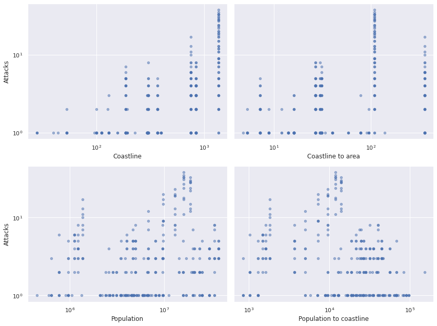
The top two and bottom two plots are very similar. We choose to use coastline length (in miles) and population as our predictors since those relationships seem to be a bit more linear on the log-log scale.
We standardize the logarithms of coastline length and population before using them as predictors.
def standardize(x):
    return (x - x.mean()) / x.std()
log_coast = np.log(attacks_df["Coastline"].values)
x_coast = at.constant(standardize(log_coast))log_pop = np.log(attacks_df["Population"].values)
x_pop = at.constant(standardize(log_pop))We use the priors \(\beta_0, \beta_{\text{coast}}, \beta_{\text{pop}} \sim N(0, 2.5^2)\) on the regression coefficients and set
\[\eta_{i, t} = \beta_0 + \beta_{\text{coast}} \cdot x_{\text{coast}, i} + \beta_{\text{pop}} \cdot x_{\text{pop}, i, t}.\] The mean is then \(\mu_{i, t} = \exp \eta_{i, t}.\)
with pm.Model() as nb_reg_model:
    β0 = pm.Normal("β0", 0., 2.5)
    β_coast = pm.Normal("β_coast", 0., 2.5)
    β_pop = pm.Normal("β_pop", 0., 2.5)
    η = β0 + β_coast * x_coast + β_pop * x_pop
    μ = at.exp(η)
As in the previous model, \(\alpha \sim \operatorname{Half}-N(2.5^2)\) and \(y_{i, t} \sim NB(\mu_{i, t}, \alpha)\).
with nb_reg_model:
    α = pm.HalfNormal("α", 2.5)
    obs = pm.NegativeBinomial("obs", μ, α, observed=y)
We again sample from the posterior distribution of the model.
with nb_reg_model:
    nb_reg_trace = pm.sample(**SAMPLE_KWARGS)
Auto-assigning NUTS sampler...
Initializing NUTS using jitter+adapt_diag...
Multiprocess sampling (3 chains in 3 jobs)
NUTS: [β0, β_coast, β_pop, α]100.00% [6000/6000 00:24<00:00 Sampling 3 chains, 0 divergences]
Sampling 3 chains for 1_000 tune and 1_000 draw iterations (3_000 + 3_000 draws total) took 25 seconds.As before, the standard sampling diagnostics show no cause for concern.
make_diagnostic_plots(nb_reg_trace);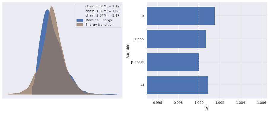
To see if the inclusion of these predictors has improved the model fit, we sample from and plot the posterior predictive distributions per state-year.
with nb_reg_model:
    nb_reg_pp_trace = pm.sample_posterior_predictive(nb_reg_trace)
100.00% [3000/3000 00:02<00:00]
nb_reg_pp_full_df = make_pp_full_df(nb_reg_pp_trace["obs"])nb_reg_pp_df = summarize_pp_df(nb_reg_pp_full_df)
grid = sns.FacetGrid(nb_reg_pp_df.reset_index(), col="State",
col_wrap=2, sharey=False, aspect=1.5)
grid.map_dataframe(plot_pp_over_time);
grid.axes[0].legend(loc="upper left");
grid.set_titles("{col_name}");
grid.fig.tight_layout();
nb_reg_pp_state_df = summarize_pp_df(nb_reg_pp_full_df, level="State")
ax = (nb_reg_pp_state_df.reset_index()
                    .plot.scatter("mean", "State", color='C0',
                                  xerr=nb_reg_pp_state_df[["low", "high"]]
                                                     .sub(nb_reg_pp_state_df["mean"],
                                                          axis=0)
                                                     .abs()
                                                     .values.T,
                                  zorder=5,
                                  label="Posterior predictive mean"))
(attacks_df.reset_index()
           .plot.scatter("Attacks", "State",
                         color='k', alpha=0.5,
                         label="Actual", ax=ax));

ax.set_xlabel("Number of shark Attacks");
ax.invert_yaxis();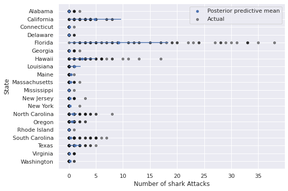
These predictions certainly appear visually better than those from the regular negative binomial model without predictors, but still leave significant room for improvement, espescially in states like Florida, California, Hawaii, and the Carolinas.
We use Pareto-smoothed importance sampling leave-one-out cross-validation (PSIS-LOO) to quantify the improvement of this model over the basic negative binomial model.
traces = {
    "NB": nb_trace,
    "NB regression": nb_reg_trace
}
fig, ax = plt.subplots()
comp_df = az.compare(traces)
az.plot_compare(comp_df, plot_ic_diff=False, ax=ax);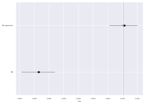
We see that the PSIS-LOO score of the regression model is significantly higher than that of the simple negative binomial model.
Mixed effects
There are many factors about each state that we have not included as predictors (average water temperature, prevalence of beach tourism, etc.). To account for this these and other unmeasured differences between states, we now add state-level mixed effects to our model.
Let \(j = 1, 2, \ldots, n_{\text{state}}\) denote the index of a state and \(j(i)\) denoth the index of the state of the \(i\)-th observation.
We place hierarchical normal priors on \(\beta_{0, j},\) \(\beta_{\text{coast}, j},\) and \(\beta_{\text{pop}, j}\) and set
\[\eta_{i, t} = \beta_{0, j(i)} + \beta_{\text{coast}, j(i)} \cdot x_{\text{coast}, i} + \beta_{\text{pop}, j(i)} \cdot x_{\text{pop}, i, t}.\] Again the mean is then \(\mu_{i, t} = \exp \eta_{i, t}.\)
The hierarchical prior for \(\beta_0\) is equivalent to
\[ \begin{align*} \mu_{\beta_0}, \gamma_{0, \text{pop}} & \sim N(0, 2.5^2) \\ \sigma_{\beta_0} & \sim \operatorname{Half}-N(2.5^2) \\ \beta_{0, j} & \sim N\left(\mu_{\beta_0} + \gamma_{0, \text{pop}} \cdot \bar{x}_{\text{pop}, j}, \sigma_{\beta_0}^2\right). \end{align*} \]
In reality, we implement this system of priors using a non-centered parametrization that is mathematically equivalent but often more computationally efficient. Note the inclusion of a term for \(\bar{x}_{\text{pop}, j}\), which is the average population for the \(j\)-th state. We include this term to avoid violating the Gauss-Markov assumptions.
j_, state_map = (attacks_df.index
                          .get_level_values("State")
                          .factorize(sort=True))
n_state = state_map.size
j = at.constant(j_)
x_pop_bar = at.constant(standardize(
attacks_df.assign(x_pop=x_pop.eval())
.groupby(level="State")
["x_pop"]
.mean()
.values
))def noncentered_normal(name, shape, μ=None):
if μ is None:
μ = pm.Normal(f"μ_{name}", 0., 2.5)
Δ = pm.Normal(f"Δ_{name}", 0., 1., shape=shape)
σ = pm.HalfNormal(f"σ_{name}", 2.5)
return pm.Deterministic(name, μ + Δ * σ)
def noncentered_normal_with_avg(name, avg_map, shape, μ=None):
if μ is None:
μ = pm.Normal(f"μ_{name}", 0., 2.5)
avg_terms_sum = 0.
for term_name, x_bar in avg_map.items():
avg_terms_sum += pm.Normal(f"γ_{name}_{term_name}_bar", 0., 2.5) * x_bar
return noncentered_normal(name, shape, μ=μ + avg_terms_sum)with pm.Model() as mixed_model:
β0 = noncentered_normal_with_avg(
"β0", {"pop": x_pop_bar}, n_state
)The prior for \(\beta_{\text{coast}, j}\) is
\[ \begin{align*} \mu_{\beta_\text{coast}}, \gamma_{\text{coast}^2}, \gamma_{\text{coast}, \text{pop}} & \sim N(0, 2.5^2) \\ \sigma_{\beta_{\text{coast}}} & \sim \operatorname{Half}-N(2.5^2) \\ \beta_{\text{coast}, j} & \sim N\left(\mu_{\beta_\text{coast}} + \gamma_{\text{coast}^2} \cdot x_{\text{coast}, j} + \gamma_{\text{coast}, \text{pop}} \cdot \bar{x}_{\text{pop}, j}, \sigma_{\beta_0}^2\right) \end{align*} \]
Here \(\bar{x}_{\text{coast}, j} = x_{\text{coast}, j}\) since the a state’s coastline does not change over time (we ignoring the effects of global warming here). Due to this fact, we do not include the term \(\gamma_{0, \text{coast}} \cdot x_{\text{coast}, j}\) in the definition of \(\beta_0\), because this term would lead to \(\mu_{\beta_{\text{coast}}}\) becoming unidentified. We use the analagous system of priors for \(\beta_{\text{pop}}.\)
log_state_coast = np.log(coast_df["Coastline"]
                                 .loc[state_map]
                                 .values)
x_coast_bar = at.constant(standardize(log_state_coast))
with mixed_model:
β_coast = noncentered_normal_with_avg(
"β_coast",
{"pop": x_pop_bar, "coast": x_coast_bar},
n_state
)
β_pop = noncentered_normal_with_avg(
"β_pop",
{"pop": x_pop_bar, "coast": x_coast_bar},
n_state)The definitions of \(\eta_{i, t}\), \(\mu_{i, t}\), and \(\alpha\) are similar to those in the previous model.
with mixed_model:
    η = β0[j] + β_coast[j] * x_coast + β_pop[j] * x_pop
    μ = at.exp(η)

    α = pm.HalfNormal("α", 2.5)
    obs = pm.NegativeBinomial("obs", μ, α, observed=y)
We again sample from the posterior distribution of the model.
with mixed_model:
    mixed_trace = pm.sample(**SAMPLE_KWARGS, target_accept=0.95)
Auto-assigning NUTS sampler...
Initializing NUTS using jitter+adapt_diag...
Multiprocess sampling (3 chains in 3 jobs)
NUTS: [μ_β0, γ_β0_pop_bar, Δ_β0, σ_β0, μ_β_coast, γ_β_coast_pop_bar, γ_β_coast_coast_bar, Δ_β_coast, σ_β_coast, μ_β_pop, γ_β_pop_pop_bar, γ_β_pop_coast_bar, Δ_β_pop, σ_β_pop, α]100.00% [6000/6000 24:00<00:00 Sampling 3 chains, 3 divergences]
Sampling 3 chains for 1_000 tune and 1_000 draw iterations (3_000 + 3_000 draws total) took 1441 seconds.
There was 1 divergence after tuning. Increase `target_accept` or reparameterize.
There were 2 divergences after tuning. Increase `target_accept` or reparameterize.
The few divergences here could be eliminated by increasing target_accept and waiting longer, but we will proceed with our analysis (I’m impatient). As before, the standard sampling diagnostics show no cause for concern.
make_diagnostic_plots(mixed_trace);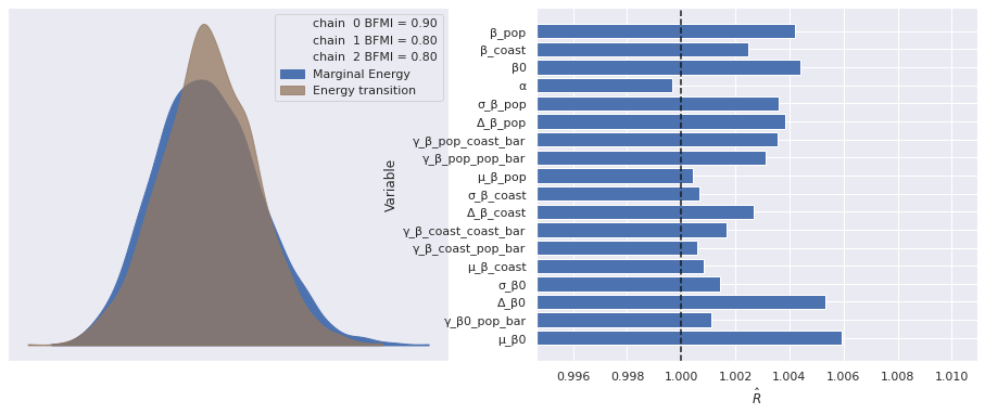
To see if the inclusion of mixed effects has improved the model fit, we sample from and plot the posterior predictive distributions per state-year.
with mixed_model:
    mixed_pp_trace = pm.sample_posterior_predictive(mixed_trace)
100.00% [3000/3000 00:05<00:00]
mixed_pp_full_df = make_pp_full_df(mixed_pp_trace["obs"])mixed_pp_df = summarize_pp_df(mixed_pp_full_df)
grid = sns.FacetGrid(mixed_pp_df.reset_index(), col="State",
col_wrap=2, sharey=False, aspect=1.5)
grid.map_dataframe(plot_pp_over_time);
grid.axes[0].legend(loc="upper left");
grid.set_titles("{col_name}");
grid.fig.tight_layout();
mixed_pp_state_df = summarize_pp_df(mixed_pp_full_df, level="State")
ax = (mixed_pp_state_df.reset_index()
                    .plot.scatter("mean", "State", color='C0',
                                  xerr=mixed_pp_state_df[["low", "high"]]
                                                     .sub(mixed_pp_state_df["mean"],
                                                          axis=0)
                                                     .abs()
                                                     .values.T,
                                  zorder=5,
                                  label="Posterior predictive mean"))
(attacks_df.reset_index()
           .plot.scatter("Attacks", "State",
                         color='k', alpha=0.5,
                         label="Actual", ax=ax));

ax.set_xlabel("Number of shark Attacks");
ax.invert_yaxis();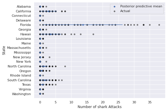
We see that the predictions for Florida, California, Hawaii, and the Carolinas are much better in this model.
traces["NB mixed"] = mixed_tracefig, ax = plt.subplots()
comp_df = az.compare(traces)
az.plot_compare(comp_df, plot_ic_diff=False, ax=ax);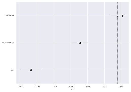
As expected the PSIS-LOO score for this model is significantly better than the fixed effects negative binomial regression model.
It is interesting but not surprising that mixed effects are required to produce reasonable predictions of the number of shark attacks in each state over time. Future posts may investigate further explanatory variables and other aspects of this data set.
This post is available as a Jupyter notebook here.
%load_ext watermark
%watermark -n -u -v -iv
Last updated: Sun Jun 27 2021
Python implementation: CPython
Python version : 3.8.8
IPython version : 7.22.0
numpy : 1.20.2
matplotlib: 3.4.1
pandas : 1.2.3
us : 2.0.2
seaborn : 0.11.1
aesara : 2.0.12
arviz : 0.11.2
pymc3 : 4.0