Bayesian Splines with Heteroskedastic Noise in Python with PyMC3
Splines are a powerful tool when modeling nonlinear relationships. This post shows how to include splines in a Bayesian model in Python using pymc3. In addition, we will show how to use a second spline component to handle heteroskedastic data, that is, data where the noise scale is not constant.

To illustrate these concepts, we will use Lidar data from Larry Wasserman’s excellent book All of Nonparametric Statistics.
Load the Data
First we make the necessary Python imports and do some light housekeeping.
%matplotlib inlinefrom warnings import filterwarningsfrom aesara import shared, tensor as at
import arviz as az
import matplotlib as mpl
from matplotlib import pyplot as plt
import numpy as np
import pandas as pd
import pymc3 as pm
import scipy as sp
import seaborn as snsYou are running the v4 development version of PyMC3 which currently still lacks key features. You probably want to use the stable v3 instead which you can either install via conda or find on the v3 GitHub branch: https://github.com/pymc-devs/pymc3/tree/v3filterwarnings('ignore', category=UserWarning, module='arviz')mpl.rcParams['figure.figsize'] = (8, 6)
sns.set(color_codes=True)We are now ready to load the data.
DATA_URL = 'http://www.stat.cmu.edu/~larry/all-of-nonpar/=data/lidar.dat'df = pd.read_csv(DATA_URL, sep=' +', engine='python')df.head()| range | logratio | |
|---|---|---|
| 0 | 390 | -0.050356 |
| 1 | 391 | -0.060097 |
| 2 | 393 | -0.041901 |
| 3 | 394 | -0.050985 |
| 4 | 396 | -0.059913 |
df.describe()| range | logratio | |
|---|---|---|
| count | 221.000000 | 221.000000 |
| mean | 554.751131 | -0.291156 |
| std | 95.912396 | 0.282475 |
| min | 390.000000 | -0.949554 |
| 25% | 472.000000 | -0.542305 |
| 50% | 555.000000 | -0.108043 |
| 75% | 637.000000 | -0.054825 |
| max | 720.000000 | 0.026907 |
We standardize both range and logratio to make it easier to specify priors once we begin building our spline models.
std_df = (df - df.mean()) / df.std()std_df.head()| range | logratio | |
|---|---|---|
| 0 | -1.717725 | 0.852467 |
| 1 | -1.707299 | 0.817981 |
| 2 | -1.686447 | 0.882398 |
| 3 | -1.676020 | 0.850240 |
| 4 | -1.655168 | 0.818631 |
Exploratory Data Analysis
The task at hand is to model (standardized) logratio as a function of (standardized) range.
fig, (std_ax, joint_ax) = plt.subplots(
    nrows=2, sharex=True, sharey=False,
    gridspec_kw={'height_ratios': [1, 4]}
)

sns.scatterplot(x="range", y="logratio", data=std_df,
                alpha=0.5, ax=joint_ax);

(std_df.groupby(std_df["range"].round(1))
       ["logratio"]
       .std()
       .rolling(5)
       .mean()
       .plot(ax=std_ax));

std_ax.set_ylabel("Standard\ndeviation\n(binned)");

fig.tight_layout();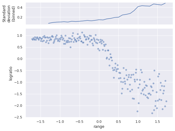
The scatter plot shows that the relationship is definitely nonlinear, and there is no obvious (to me at least) transform of logratio that will make the relationship linear. The top plot shows how the (binned, smoothed) standard deviation of logratio varies with range. As is evident from both plots, as range increases, so does the scale of variation of logratio.
Introduction to Splines
Regression splines are a type of of generalized additive model (GAM) that use linear combinations of (generally low-degree) polynomials to introduce nonlinear relationships between covariates and responses.
To begin constructing our spline model, we must choose a number of knots (also known as anchors or control points) in the domain of our co variate. In this post we will use twenty splines in the interval \([-1.75, 1.75]\), which comfortably contains the observed values of range.
N_KNOT = 20

knots = np.linspace(-1.75, 1.75, N_KNOT)
The following plot shows the location of the knots in the Lidar data.
fig, (std_ax, joint_ax) = plt.subplots(
    nrows=2, sharex=True, sharey=False,
    gridspec_kw={'height_ratios': [1, 4]}
)

sns.scatterplot(x="range", y="logratio", data=std_df,
                alpha=0.5, ax=joint_ax);
sns.rugplot(knots, height=0.075,
            c='k', label="Knots",
            ax=joint_ax);

(std_df.groupby(std_df["range"].round(1))
       ["logratio"]
       .std()
       .rolling(5)
       .mean()
       .plot(ax=std_ax));
sns.rugplot(knots, height=0.15,
            c='k', label="Knots",
            ax=std_ax);

std_ax.set_ylabel("Standard\ndeviation\n(binned)");

joint_ax.legend();
fig.tight_layout();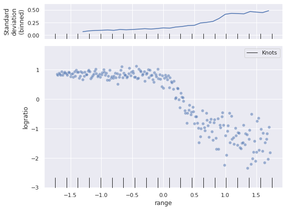
Let \(x^*_i\), \(i = 1, 2, \ldots, 20\) be the location of the \(j\)-th knot. The spline model we will use is given by
\[E(Y\ |\ X) = \sum_{j = 1}^{20} \beta_j \cdot B_{j, k; \mathbf{x}^*}(X)\].
(If one applies a link function to the conditional expectation of the left hand side, this becomes a generalized additive model.) For spline regression, \(B_{j, k; \mathbf{x}^*}(\cdot)\) is a \(k\)-th-degree polynomial in \(x\) and \(x^*\). There are many possible choices for these functions. We will use scipy’s cubic B-spline implementation. For more information splines, consult Simon Wood’s excellent book Generalized Additive Models.
basis = sp.interpolate.BSpline(knots, np.eye(N_KNOT), 3)We see that basis is a callable function function that will give the design matrix for spline regression at a given set of points.
hasattr(basis, '__call__')TrueWe build this design matrix at the (standardized) value of range.
dmat = shared(basis(std_df["range"]))With dmat in hand, we are ready to build our model with pymc3. We follow the model specified in Milad Kharratzadeh’s excellent short paper Splines in Stan.
The model for the conditional mean is given above,
\[\mu\ |\ X = \sum_{j = 1}^{20} \beta_j \cdot B_{j, k; \mathbf{x}^*}(X).\]
We put a Gaussian random walk prior (GRW) on these coefficients \(\beta_j\), under the intuition that the coefficients for adjacent knots should be similar. We parameterize our GRW as follows:
\[ \begin{align*} \mu_{\beta} & \sim N(0, 2.5^2) \\ \Delta_{\beta, j} & \sim N(0, 1) \\ \sigma_{\beta} & \sim \mathrm{Half}-N(2.5^2) \\ \beta_j & = \mu_{\beta} + \sigma_{\beta} \cdot \sum_{i = 1}^j \Delta_{\beta, i}. \end{align*} \]
# the scale necessary to make a halfnormal distribution
# have unit variance
HALFNORMAL_SCALE = 1. / np.sqrt(1. - 2. / np.pi)
coords = {"knot": np.arange(N_KNOT)}
with pm.Model(coords=coords) as model:
μ_β = pm.Normal("μ_β", 0., 2.5)
Δ_β = pm.Normal("Δ_β", 0., 1., dims="knot")
σ_β = pm.HalfNormal("σ_β", 2.5 * HALFNORMAL_SCALE)
β = pm.Deterministic("β", μ_β + σ_β * Δ_β.cumsum(),
dims="knot")
μ = at.dot(dmat, β)Our observational model here is normal, with unknown variance \(\sigma \sim \mathrm{Half-}N(2.5^2)\).
with model:
    σ = pm.HalfNormal("σ", 2.5 * HALFNORMAL_SCALE)
    obs = pm.Normal("obs", μ, σ, observed=std_df["logratio"])
We now sample from the posterior distribution of this model.
SEED = 123456789
CORES = 3

SAMPLE_KWARGS = {
    'cores': CORES,
    'random_seed': [SEED + i for i in range(CORES)],
    'return_inferencedata': True,
    'target_accept': 0.95
}
with model:
trace = pm.sample(**SAMPLE_KWARGS)Auto-assigning NUTS sampler...
Initializing NUTS using jitter+adapt_diag...
Multiprocess sampling (3 chains in 3 jobs)
NUTS: [μ_β, Δ_β, σ_β, σ]100.00% [6000/6000 02:21<00:00 Sampling 3 chains, 0 divergences]
Sampling 3 chains for 1_000 tune and 1_000 draw iterations (3_000 + 3_000 draws total) took 142 seconds.None of the standard sampling diagnostics show cause for concern.
az.plot_energy(trace);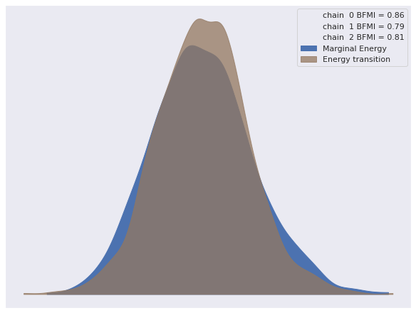
az.rhat(trace).max()<xarray.Dataset>
Dimensions: ()
Data variables:
μ_β float64 1.002
Δ_β float64 1.003
σ_β float64 1.003
σ float64 1.001
β float64 1.002
-
-
-
-
μ_β()float641.002
array(1.00177301)
-
Δ_β()float641.003
array(1.00304857)
-
σ_β()float641.003
array(1.00278469)
-
σ()float641.001
array(1.00087722)
-
β()float641.002
array(1.00209198)
-
-
To visualize our predictions, we sample from the posterior predictive distribution along a grid of reasonable values for range.
pp_range = np.linspace(-1.75, 1.75, 100)
dmat.set_value(basis(pp_range))
with model:
pp_trace = pm.sample_posterior_predictive(trace)100.00% [3000/3000 00:00<00:00]
We now plot the posterior predictions.
fig, (std_ax, joint_ax) = plt.subplots(
    nrows=2, sharex=True, sharey=False,
    gridspec_kw={'height_ratios': [1, 4]}
)

low, high = np.percentile(pp_trace["obs"], [2.5, 97.5], axis=0)
joint_ax.fill_between(pp_range, low, high,
                      color='k', alpha=0.25,
                      label="95% credible interval");

sns.scatterplot(x="range", y="logratio", data=std_df,
                alpha=0.5, ax=joint_ax);

(std_df.groupby(std_df["range"].round(1))
       ["logratio"]
       .std()
       .rolling(5)
       .mean()
       .plot(ax=std_ax, label="Actual"));

std_ax.plot(pp_range, pp_trace["obs"].std(axis=0),
            c='k', label="Posterior predictive");

joint_ax.plot(pp_range, pp_trace["obs"].mean(axis=0),
              c='k', label="Posterior expected value");

std_ax.set_ylabel("Standard\ndeviation\n(binned)");

std_ax.legend(loc='upper left', bbox_to_anchor=(0., 1.65));
joint_ax.legend(loc='lower left');
fig.tight_layout();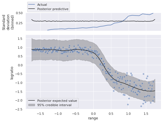
Visually, we appear to have captured the relationship between range and the expected value of logratio reasonably well. The credible interval and the standard deviation above are a bit odd though. We have built a homoskedastic (same-variance) observational model, so the credible interval has roughly the same width, even though the data show a small variance for small values of range, and variance increases as range does.
Accounting for heteroskedasticity
In order to remedy this issue, we will build a heteroskedastic model that allows the variance of logratio to vary with ratio. In fact, we will use a spline to model the changing variance as well.
Let \(\gamma_j\) come from a GRW similar to \(\beta_j\). We define
\[ \begin{align*} \eta_{\sigma}\ |\ X & = \sum_{j = 1}^{20} \gamma_j \cdot B_{j, k; \mathbf{x}^*}(X) \\ \sigma\ |\ X & = 0.05 + \exp(\eta_{\sigma}). \end{align*} \]
Note that the \(0.05\) factor in the definition of \(\sigma\ |\ X\) sets a lower bound on the variance, which is necessary for computational stability.
The model is a straightforward adaptation of the homoskedastic one.
dmat.set_value(basis(std_df["range"]))with pm.Model(coords=coords) as var_model:
β0 = pm.Normal("β0", 0., 2.5)
Δ_β = pm.Normal("Δ_β", 0., 1., dims="knot")
σ_β = pm.HalfNormal("σ_β", 2.5 * HALFNORMAL_SCALE)
β = pm.Deterministic("β", β0 + Δ_β.cumsum() * σ_β,
dims="knot")
μ = at.dot(dmat, β)
γ0 = pm.Normal("γ0", 0., 2.5)
Δ_γ = pm.Normal("Δ_γ", 0., 1., dims="knot")
σ_γ = pm.HalfNormal("σ_γ", 2.5 * HALFNORMAL_SCALE)
γ = pm.Deterministic("γ", γ0 + Δ_γ.cumsum() * σ_γ,
dims="knot")
η_σ = at.dot(dmat, γ)
σ = 0.05 + at.exp(η_σ)
obs = pm.Normal("obs", μ, σ, observed=std_df["logratio"])We now sample from this model.
with var_model:
    var_trace = pm.sample(**SAMPLE_KWARGS)
Auto-assigning NUTS sampler...
Initializing NUTS using jitter+adapt_diag...
Multiprocess sampling (3 chains in 3 jobs)
NUTS: [β0, Δ_β, σ_β, γ0, Δ_γ, σ_γ]100.00% [6000/6000 04:42<00:00 Sampling 3 chains, 0 divergences]
Sampling 3 chains for 1_000 tune and 1_000 draw iterations (3_000 + 3_000 draws total) took 282 seconds.Again the sampling diagnostics show no cause for concern.
az.plot_energy(var_trace);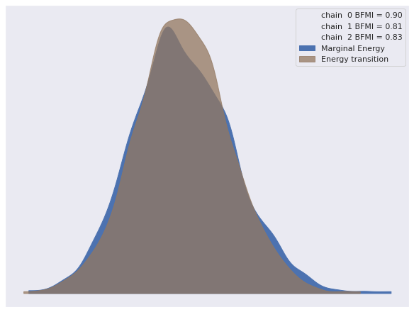
az.rhat(var_trace).max()<xarray.Dataset>
Dimensions: ()
Data variables:
β0 float64 0.9998
Δ_β float64 1.006
σ_β float64 1.0
γ0 float64 1.001
Δ_γ float64 1.005
σ_γ float64 1.0
β float64 1.002
γ float64 1.002
-
-
-
-
β0()float640.9998
array(0.99984598)
-
Δ_β()float641.006
array(1.00613202)
-
σ_β()float641.0
array(1.00047073)
-
γ0()float641.001
array(1.0010354)
-
Δ_γ()float641.005
array(1.00481044)
-
σ_γ()float641.0
array(1.00035778)
-
β()float641.002
array(1.00226144)
-
γ()float641.002
array(1.00190525)
-
-
We do see that the values of \(\gamma_j\) that correspond to small values of range have small coefficients, and the coefficients grow as range gets larger.
ax, = az.plot_forest(var_trace, var_names=["γ"])

ax.set_xlabel(r"$\gamma_j$");

ax.set_yticklabels(np.arange(N_KNOT)[::-1]);
ax.set_ylabel("$j$");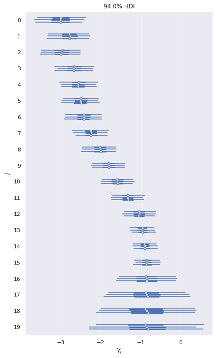
Again we sample from the posterior predictive distribution of this model.
dmat.set_value(basis(pp_range))with var_model:
pp_var_trace = pm.sample_posterior_predictive(var_trace)100.00% [3000/3000 00:00<00:00]
We plot these predictions in order to compare them to those of the homoskedastic model.
fig, (std_ax, joint_ax) = plt.subplots(
    nrows=2, sharex=True, sharey=False,
    gridspec_kw={'height_ratios': [1, 4]}
)

low, high = np.percentile(pp_var_trace["obs"], [2.5, 97.5], axis=0)
joint_ax.fill_between(pp_range, low, high,
                      color='k', alpha=0.25,
                      label="95% credible interval");

sns.scatterplot(x="range", y="logratio", data=std_df,
                alpha=0.5, ax=joint_ax);

(std_df.groupby(std_df["range"].round(1))
       ["logratio"]
       .std()
       .rolling(5)
       .mean()
       .plot(ax=std_ax, label="Actual"));

std_ax.plot(pp_range, pp_trace["obs"].std(axis=0),
            c='k', label="Posterior predictive\n(homoskedastic)");
std_ax.plot(pp_range, pp_var_trace["obs"].std(axis=0),
            c='r', ls='--',
            label="Posterior predictive\n(heteroskedastic)");

joint_ax.plot(pp_range, pp_trace["obs"].mean(axis=0),
              c='k', label="Posterior predictive\n(homoskedastic)");
joint_ax.plot(pp_range, pp_var_trace["obs"].mean(axis=0),
              c='r', ls='--',
              label="Posterior predictive\n(heteroskedastic)");

std_ax.set_ylabel("Standard\ndeviation\n(binned)");

std_ax.legend(loc='upper left', ncol=3,
              bbox_to_anchor=(0., 1.6));
joint_ax.legend(loc='lower left');
fig.tight_layout();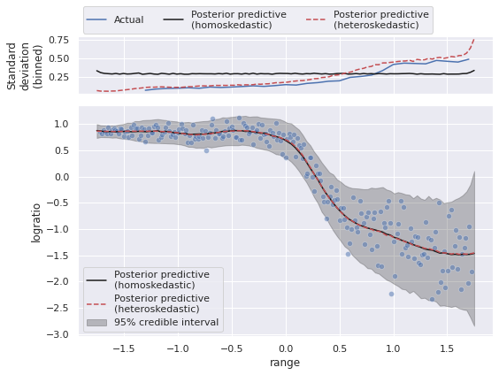
We see that the homo- and heteroskedastic models produce essentially the same estimate of the expected value of logratio, but that the heteroskedastic model comes closer to capturing the true change in the variance.
We now compare these two models using Pareto-smoothed importance sampling leave-one-out cross-validation (PSIS-LOO).
traces = {
    'Homoskedastic': trace,
    'Heteroskedastic': var_trace
}
comp_df = az.compare(traces)comp_df.loc[:, :"weight"]| rank | loo | p_loo | d_loo | weight | |
|---|---|---|---|---|---|
| Heteroskedastic | 0 | 41.369658 | 17.759399 | 0.000000 | 1.000000e+00 |
| Homoskedastic | 1 | -41.703944 | 14.188435 | 83.073602 | 8.058976e-11 |
fig, ax = plt.subplots()

az.plot_compare(comp_df, plot_ic_diff=False, ax=ax);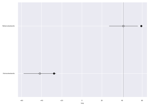
Interestingly, the PSIS-LOO score for the heteroskedastic model is significantly higher than that of the homoskedastic model, even though these two models predict essentially the same conditional mean.
This post is available as a Jupyter notebook here.